Embed your authority
Client: NZ Drug Foundation
BRONZE: 2014 BEST AWARDS
Drug use encompasses some very complex issues.
Communicating that, positioning the Foundation as the authority on the subject, and delivering communication cut-through were the challenges we needed to address.
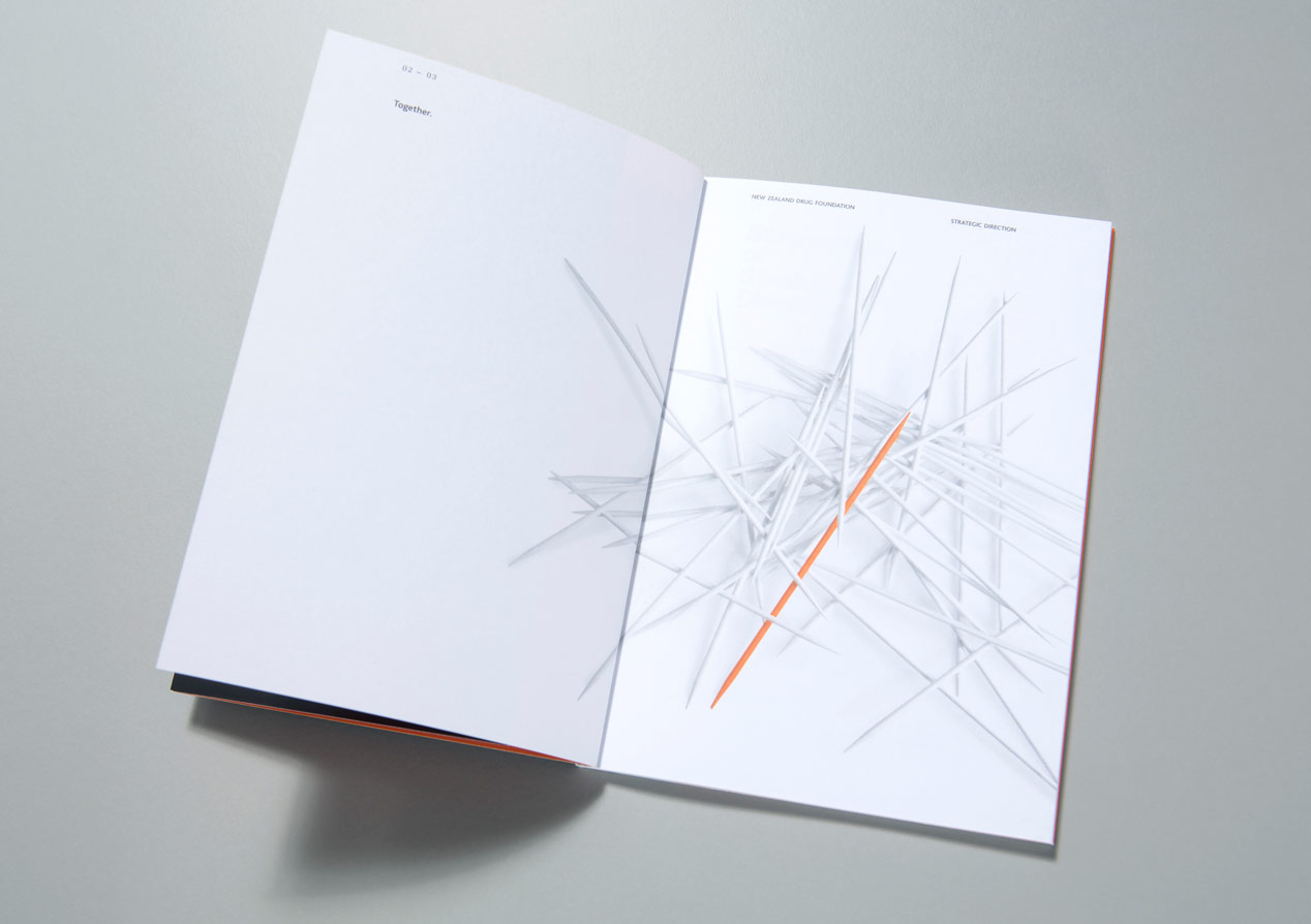
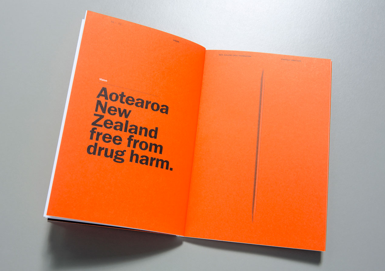
A visual metaphor of pick up sticks spoke to the complexity of the issues and provided a framework for unraveling the story, while a non-traditional format (a pocket-sized book) and high quaity finishing techniques made sure we were noticed.
The Brief
New Zealand Drug Foundation (NZDF) has a clear brand position at the heart of all major alcohol and drug policy debate, led by the best evidence available over the past 20 years. Whether we like it or not, New Zealanders use drugs. Drug use can cause social, health and economic harms and cost individuals, families and communities dearly. Preventing and reducing harm from drug use is a big challenge and one the NZDF has taken on. The communication objective was to express this challenge through the 2013 Statement of Intent to an audience of policy makers and influencers within Government, partners and international peers.
The Solution
What the client really wanted was to cut through all the rhetoric on drug use in order to position them as the authority on the matter.
To leverage off their brand ‘being at the heart of the matter’ positioning, we used a familiar game metaphor - pick up sticks. This spoke to the complexity of the issues they are dealing with, the individual and collective responsibility for action and also the challenge of identifying the facts in a complex world of information (and misinformation).
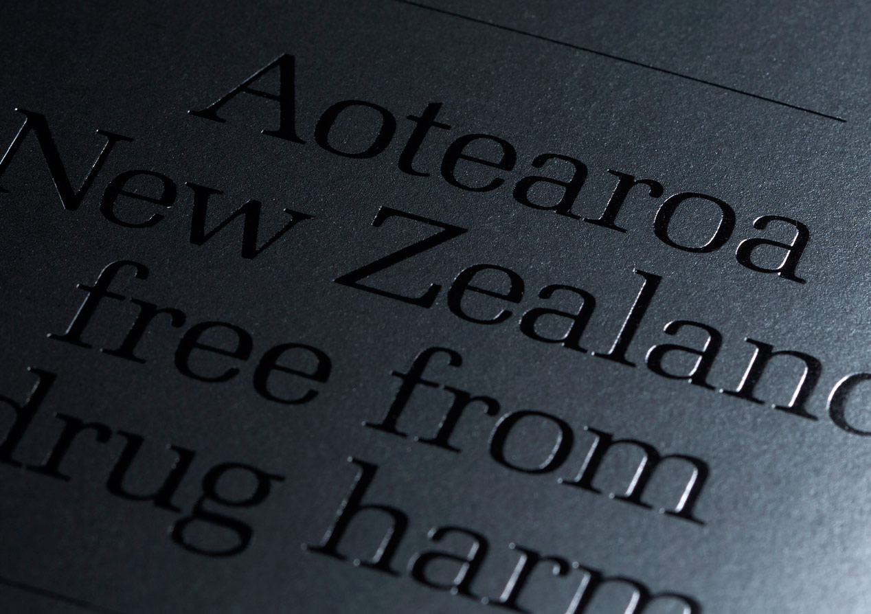
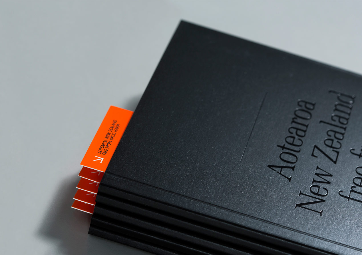
With few exceptions, these types of documents are A4 in size. This traditional format, along with their usually dry statutory content, doesn’t engage audiences to want to pick them up and read them. Our solution revolved around creating a pocket-sized document that would stand out against other similar documents by being the compelling and essential authority on the matter.
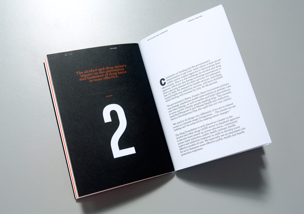
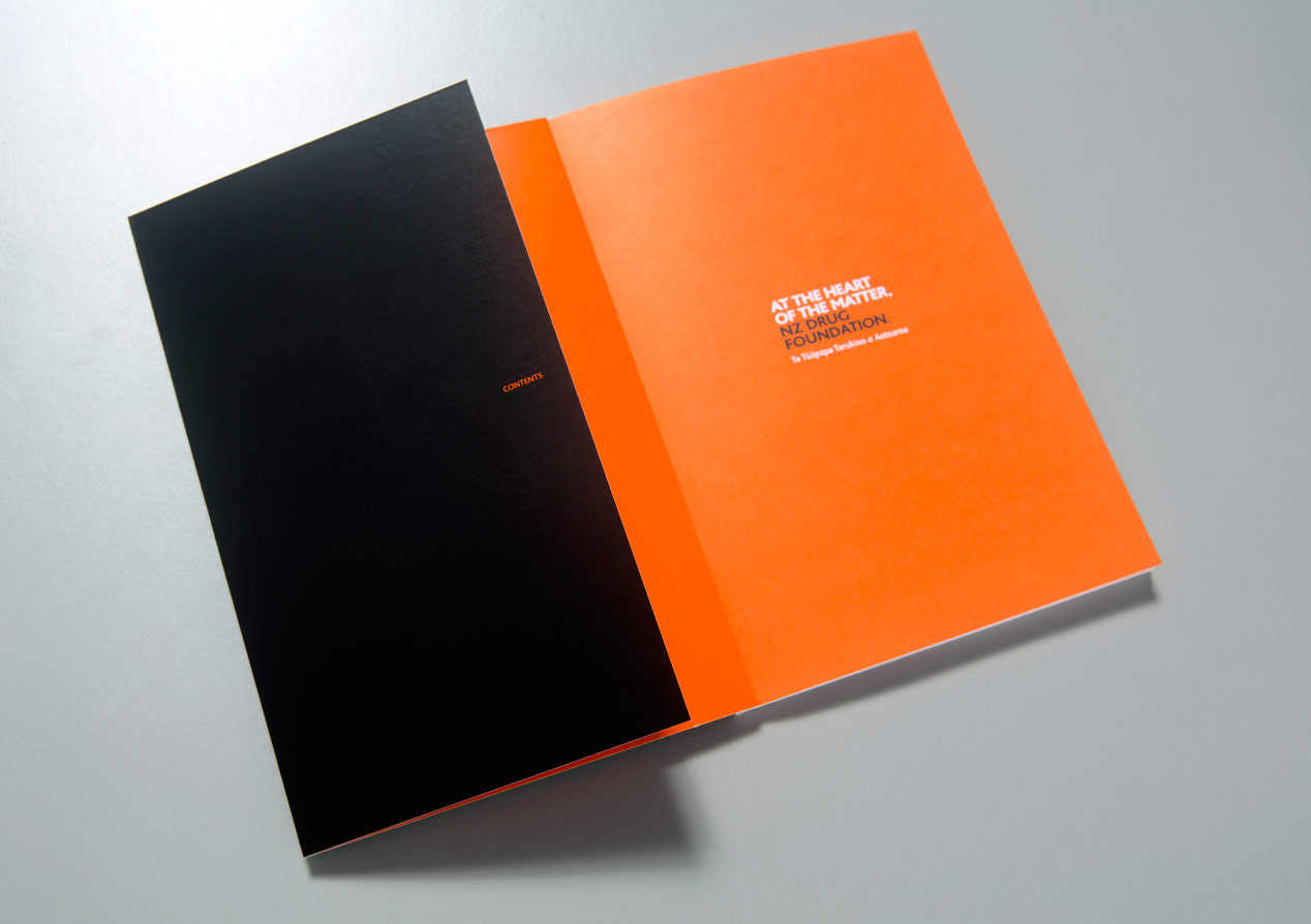
NZDF is a registered charity and as such they are always conscious of not appearing to be frivolous. Our approach used their brand colours to their full potential to create a striking visual effect. Boldness and confidence is exerted in the strong brand colours - orange and black - with a simple foil embossed cover that creates a surprising and appealing little black book. The pick up sticks metaphor is photographically applied throughout the document to express connectivity, clear focus and collaboration.
To assist with the audience navigation clear succinct typography was used. We also created a simple but effective bookmark to encourage readership and trigger the notion that this document is worth picking up and referring to often. The addition of an overarching copy line detail of “Together” reinforces collective concept.
The Results
New Zealand Drug Foundation have reported that cut-through has been emphatically achieved. They’ve seen a measurable enhancement in their brand position including a strong audience connection that they are the leaders and authority at the heart of the matter, with clear direction expressed through this ‘manifesto’. We have also received unsolicited phone calls from third parties who have received the document complementing us on its effectiveness and high quality finishing.