‘Let your imagination take you places’
Client: New Zealand Symphony Orchestra
FINALIST: 2016 BEST AWARDS
Capturing the fully immersive nature of an NZSO experience drove the challenge we set ourselves for marketing their 2016 season.
Providing a strong visual voice in the arts landscape, the resulting campaign is also attracting stronger than expected audiences.
The Brief
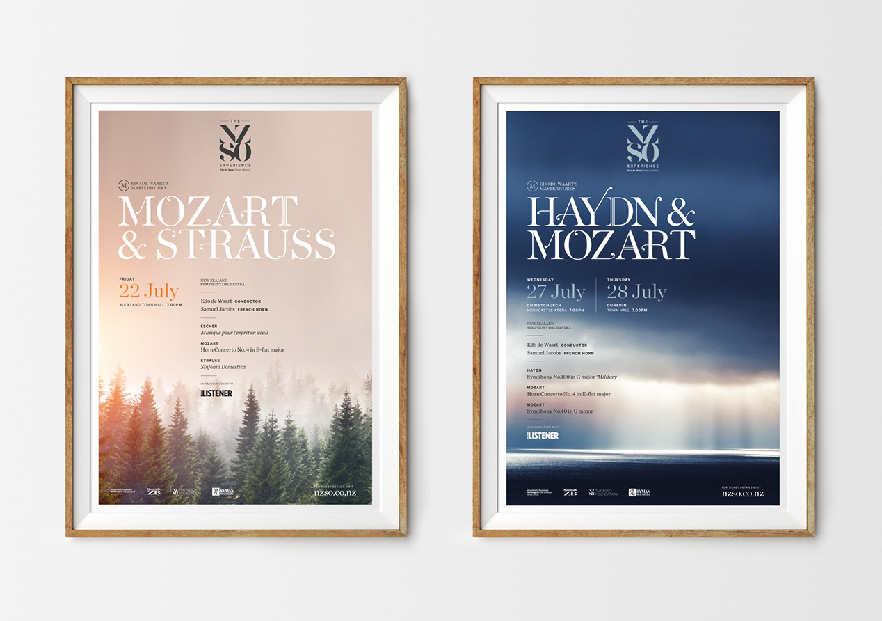
NZSO asked us to create a compelling and impactful theme that expresses the essence of Season 2016, introduces their new musical director, Edo de Waart and firmly reinforces the core elements of the NZSO brand experience. Specifically, we were asked to produce a season brochure as well as individual campaign imagery for seventeen concerts throughout the year. Our approach needed to deliver real cut-through in the wider entertainment landscape and become the basis for a consistent visual tone that allowed NZSO audiences to easily identify upcoming concerts.
Overall our work needed to result in more subscribers, casual ticket buyers and first-time audiences.
The Solution
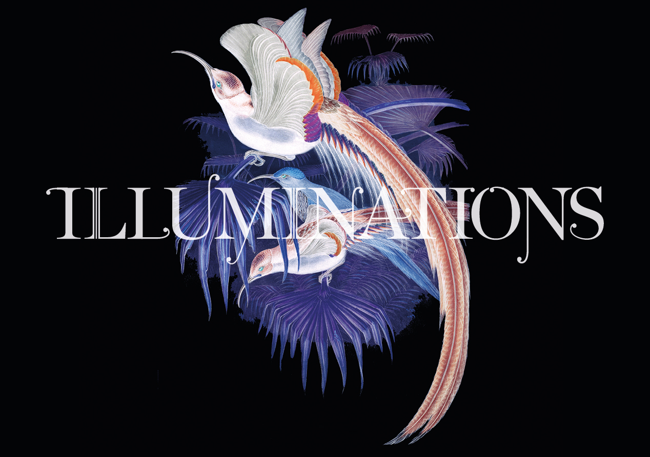
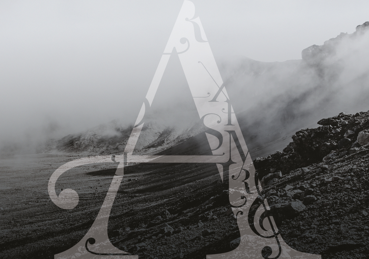
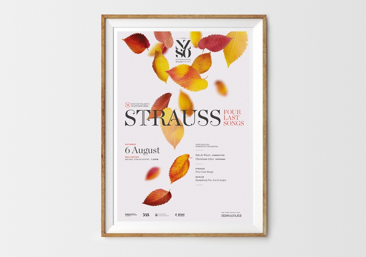
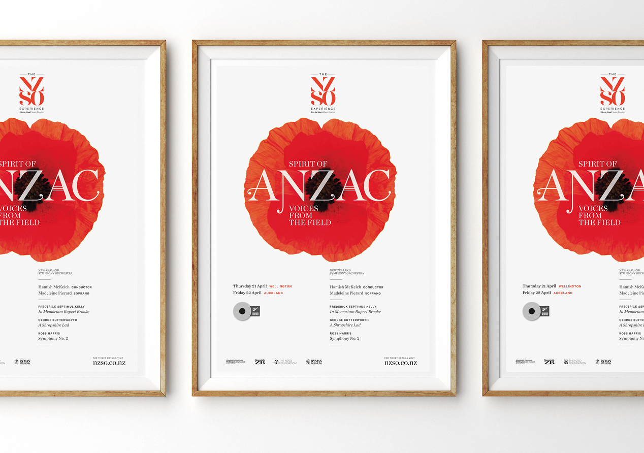
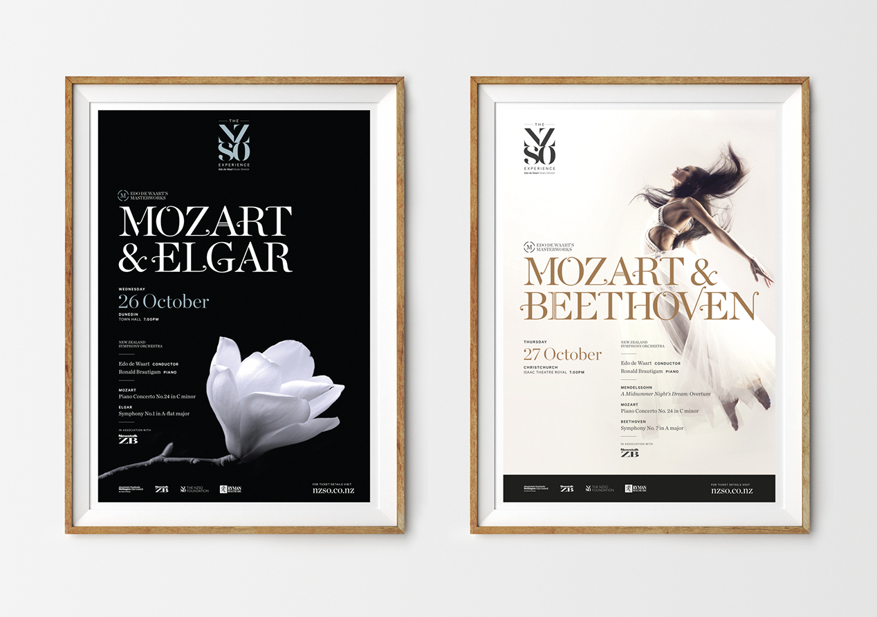
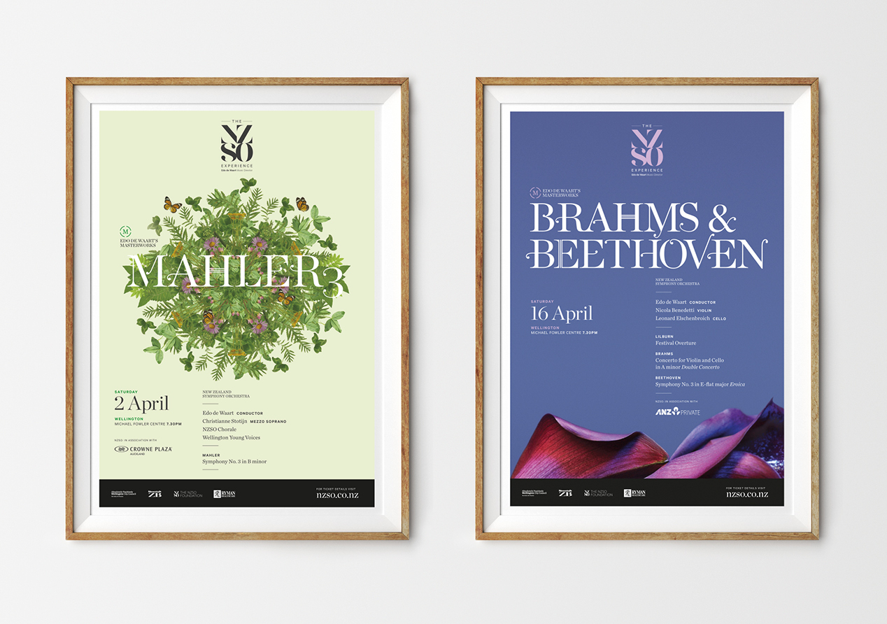
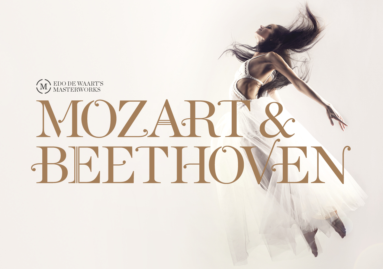
Our conceptual theme was ‘Let your imagination take you places’. The idea captures the fully immersive nature of an NZSO experience and speaks to the breadth of the Season’s concerts – from contemporary New Zealand music to masterpieces from the classical and romantic orchestral repertoire – a programme of many lands, places, moments and perspectives. The theme incorporates the places where Edo is taking the NZSO: new heights they’ve never reached before.
The considered imagery reflects the wonder and transporting effect of a classical music concert by utilising a mix of literal and conceptual elements to depict the experience. The design approach itself embodies the force of the orchestra, including the nuances and texture of the music, helping the reader lose themselves in other times and places.
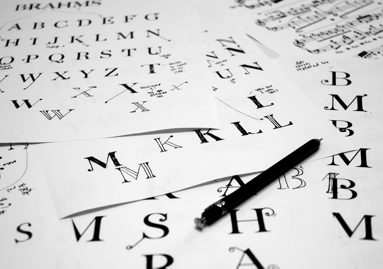
To best link the varying imagery across concerts, a custom typography was developed that is highly adaptive and evocative of the music itself.
The season brochure combines the imagery and typography elements, within a deliberately limited colour palette, to deliver an elegant and sophisticated piece that speaks to the mastery of the NZSO while remaining uniquely Kiwi and accessible.
The on-going concert campaign is characterised by strong visual imagery coupled with the custom display typography, making for striking material that really stands out in bus shelters, on street posters, on concert programmes and in online advertising.
The Results
Audiences have responded well to the material. Internally, NZSO are proud of the work, feeling it gives the NZSO, and Season 2016, a strong visual voice in the arts landscape. Externally the material is helping the Season have a strong presence, resulting in stronger than expected attendance numbers so far.