We share the same sun
Client: Lion
To translate Lion’s brand proposition “Bringing more sociability and wellbeing to our world” to create a unifying visual identity, we focused on the meaning of sociability and wellbeing. Somehow, we had to find some common ground between their traditional brewing business and their newly acquired dairy business.
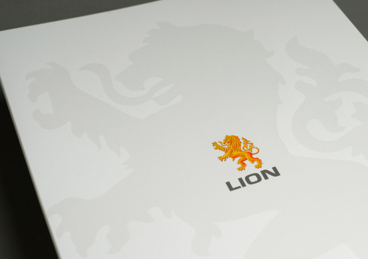
The resulting idea radiant-sunshine reflected the qualities and attributes of the Lion brand and became the starting point for a warm visual identity characterised by colour, energy, vibrancy and a bright positive future.
The Brief
When Lion Nathan purchased National Foods we managed the rebrand to Lion Nathan National Foods. In 2011 we were the design agency in their next rebrand to Lion. The objective was to firmly position Lion as one organisation - not separate beer and dairy businesses – and thereby unify their entire corporate brand and provide clarity both internally and externally.
The Lion brand proposition is expressed as: “Bringing more sociability and wellbeing to our world” and this brand notion permeates everything the organisation does including core purpose, identity, values, and vision.
The Solution
Our strategic and creative solution was centred on translating what sociability and wellbeing means to Lion and its audiences (including customers, staff, stakeholders, suppliers, media) and how this relates across alcoholic beverages, and dairy and juice products. Fundamentally, this was distilled into one question ‘how can sociability and wellbeing be best expressed?
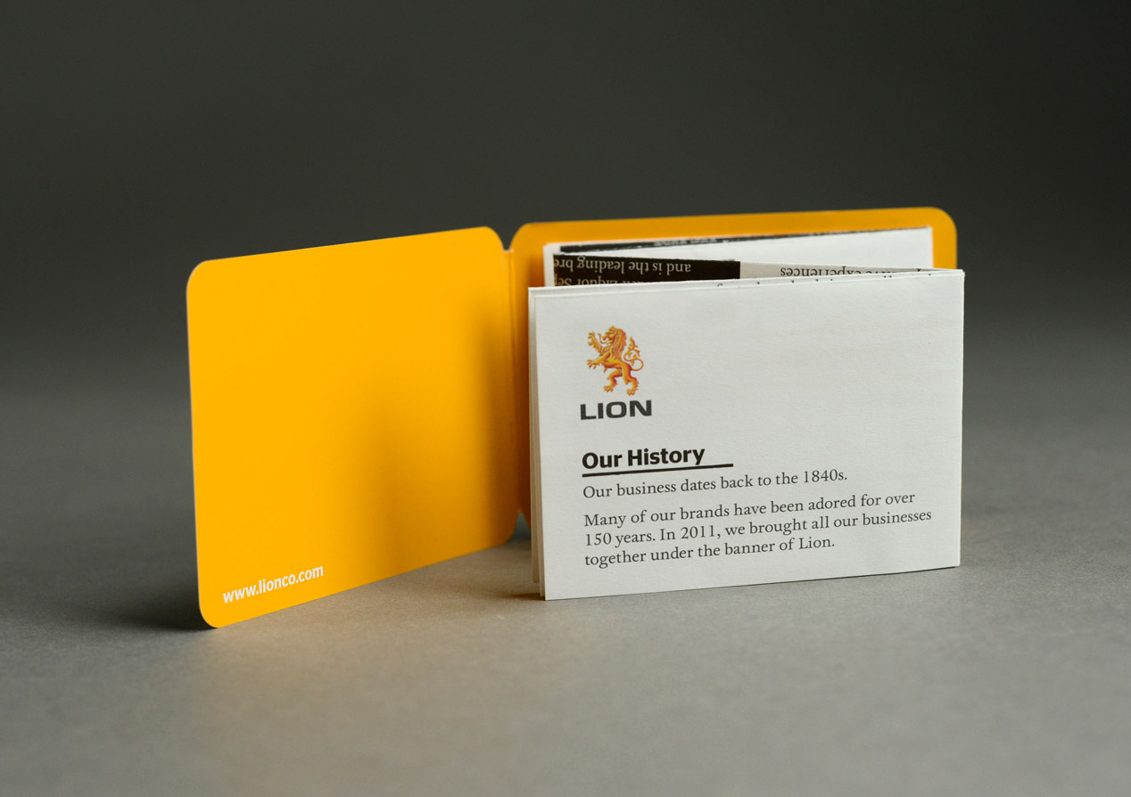
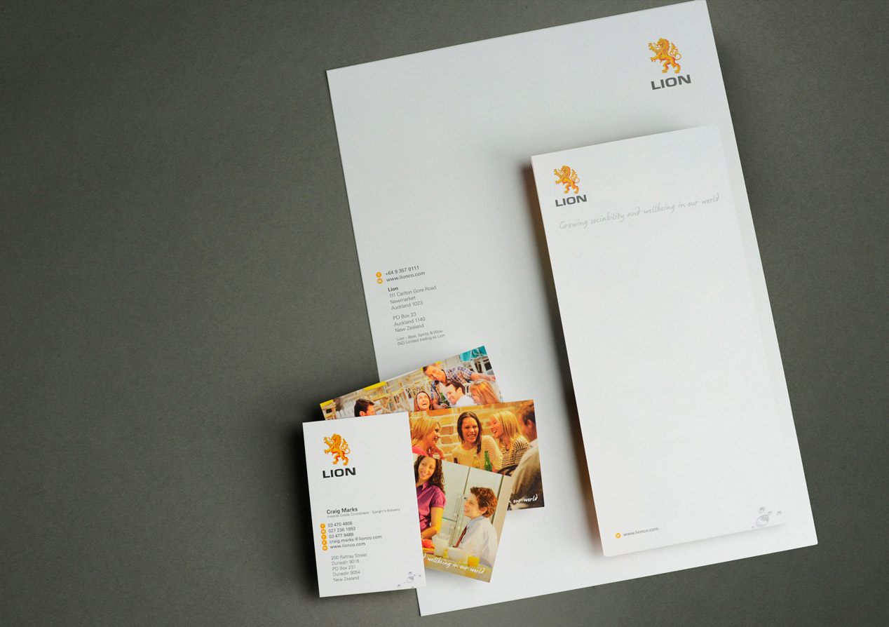
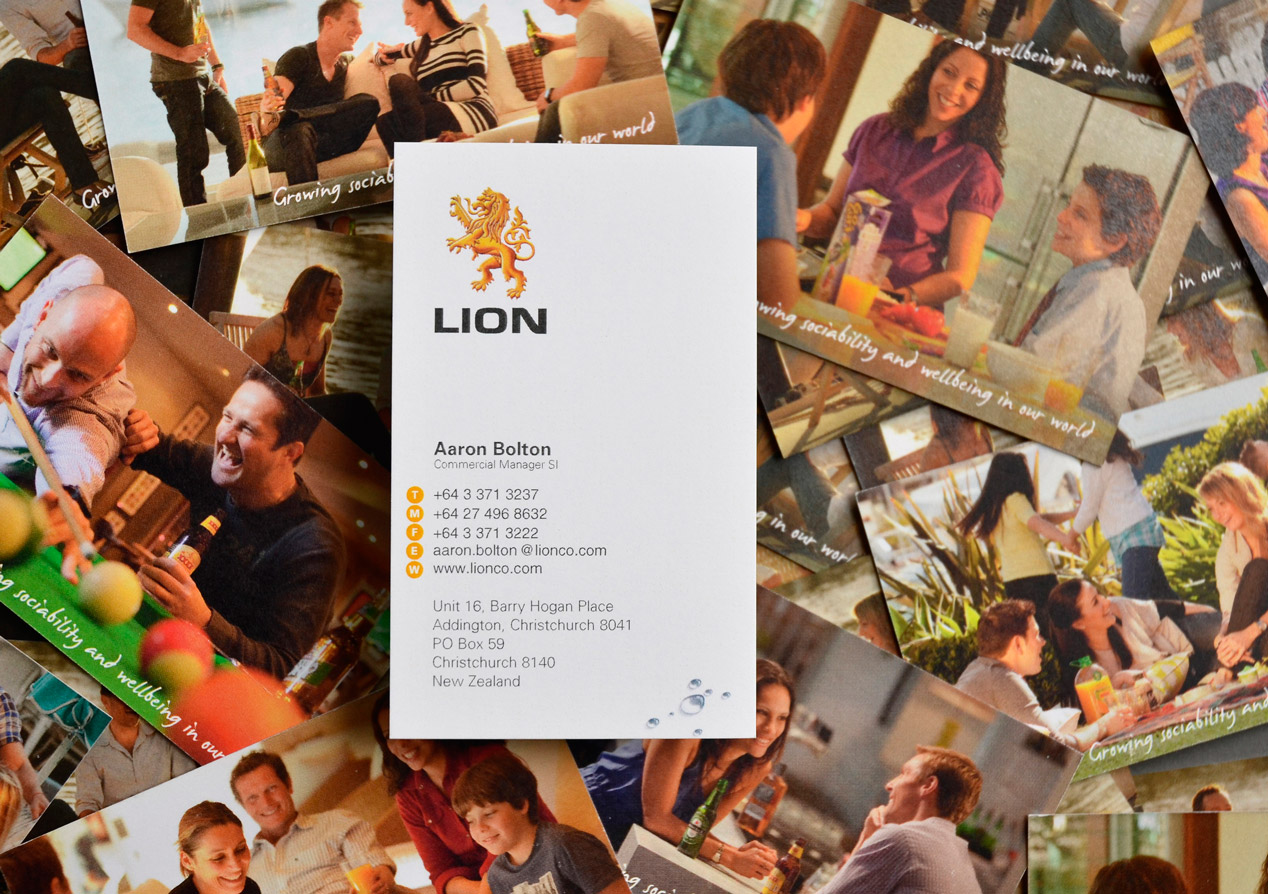
The answer was the single-minded idea of ‘radiant sunshine.’ The values and qualities we associate with sunshine include: essential for life, promotes growth, warm, shining, bright, uplifting and comforting. These are well aligned with the positioning Lion was looking for. We then looked at the emotive cues (e.g. socialising, eating and drinking with friends outside at home, cafes, picnics and BBQs, fond memories of childhood summers), the logical support (e.g. vitamin D, endorphins, melatonin), and for strong brand associations (positive, natural, good for you in moderation, colour alignment with key products, many of the product ingredients are a result of the energy provided by sunshine). The notion of radiant sunshine and the associated values, qualities and associations became the points of reference for developing the visual identity elements that included the logo, colour palette, font selection and typographic styles, photography styles, graphic language elements; and tone of voice.
The Result
From here we combined the identity elements to deliver a wide range of signage and stationery requirements as well as an in-house magazine (ROAR). We followed this up with a comprehensive online toolbox of all design elements, including guidelines on do’s and dont’s. We have subsequently developed a number of sub-brands including guidelines for these.