An Easter tonic in turbulent times
Client: Insight Creative
2021 INTERNATIONAL DESIGN AWARDS (IDA) - SILVER
Every year we celebrate Easter with a little something for our clients.
The Brief
With the pandemic driving an environment of economic depression, many clients were feeling the pressure of change and uncertainty. The fluffy bunnies of previous years felt somewhat inappropriate this year. How then, do we make Easter celebrations relevant in 2021?
The Solution
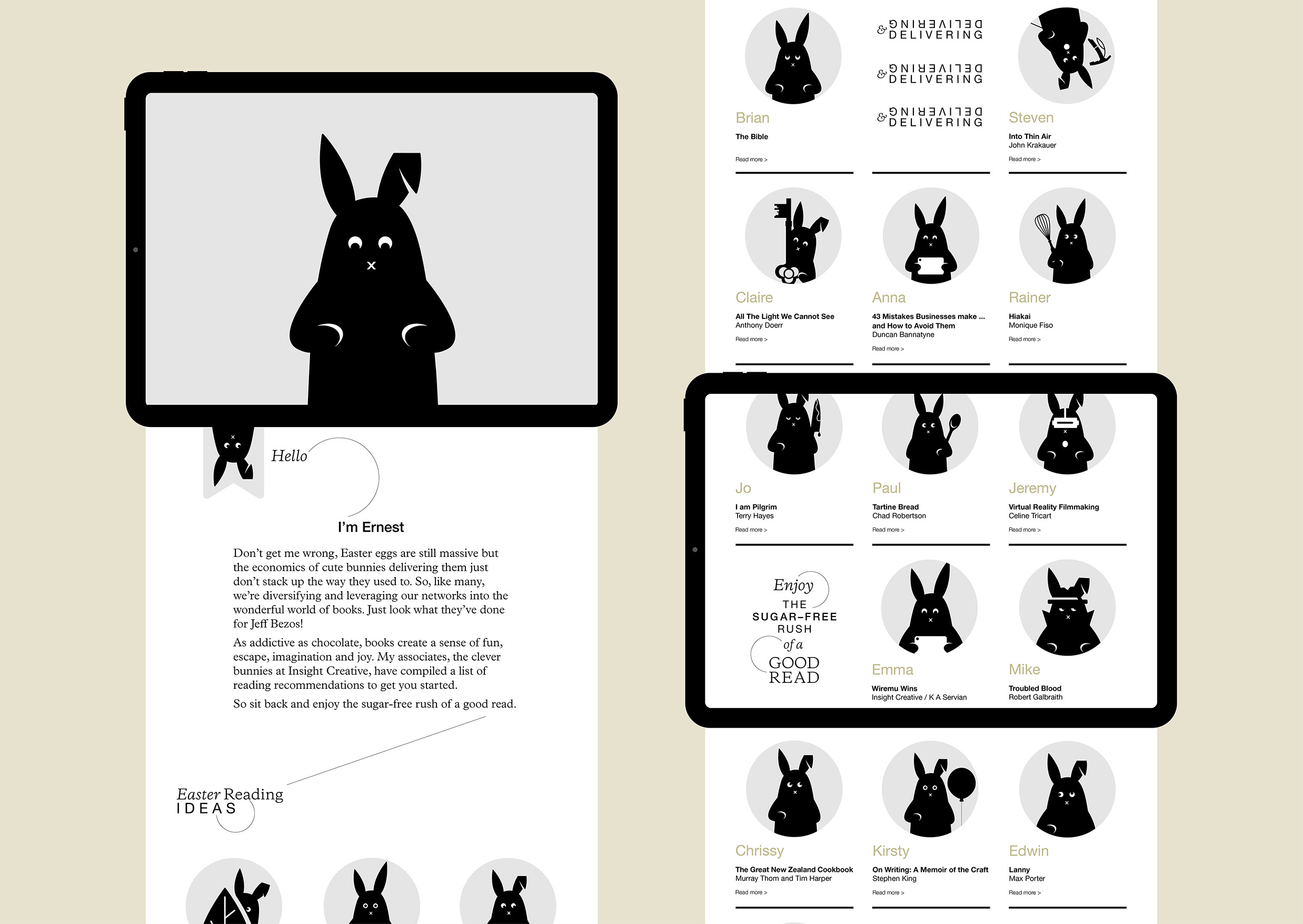
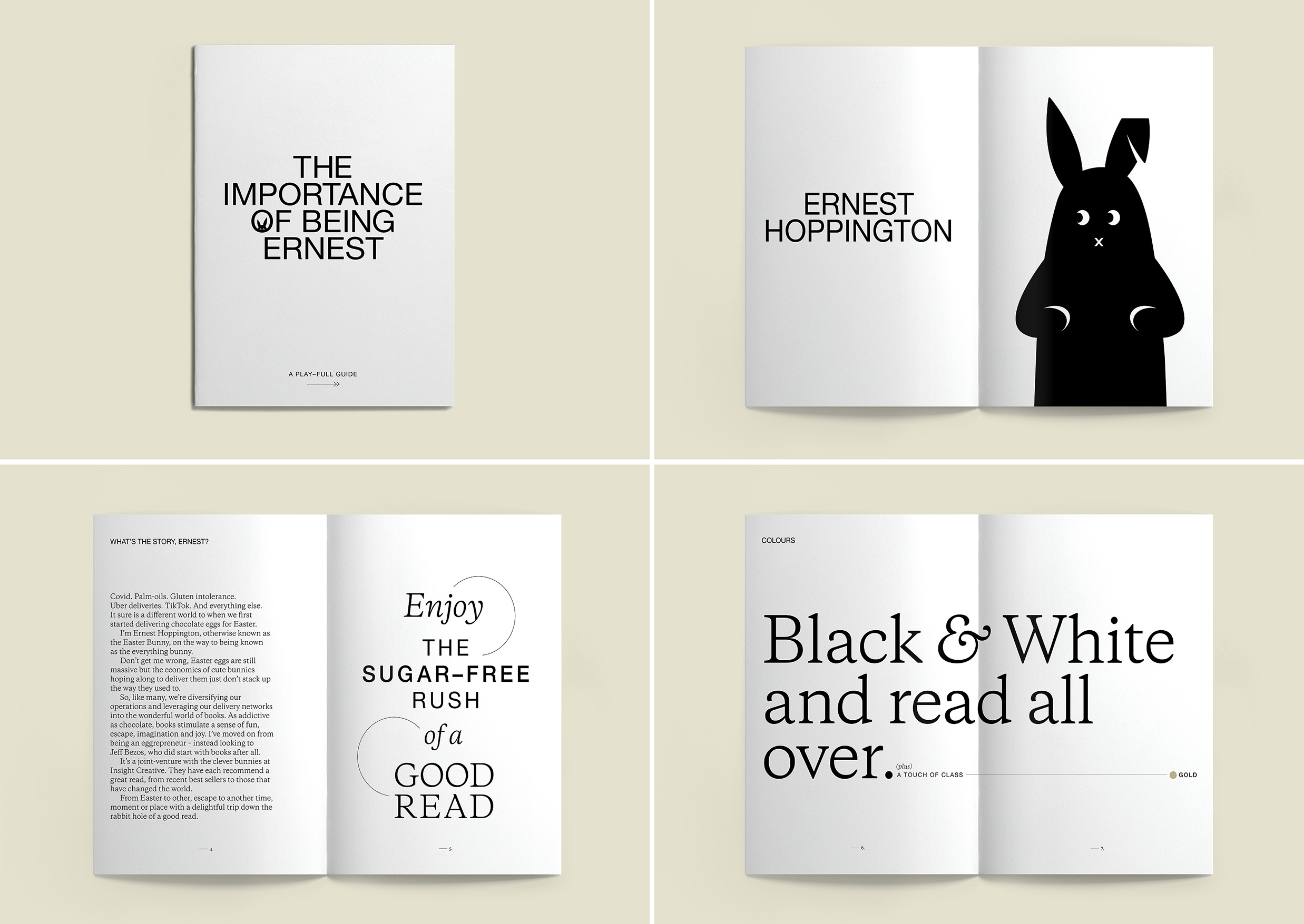
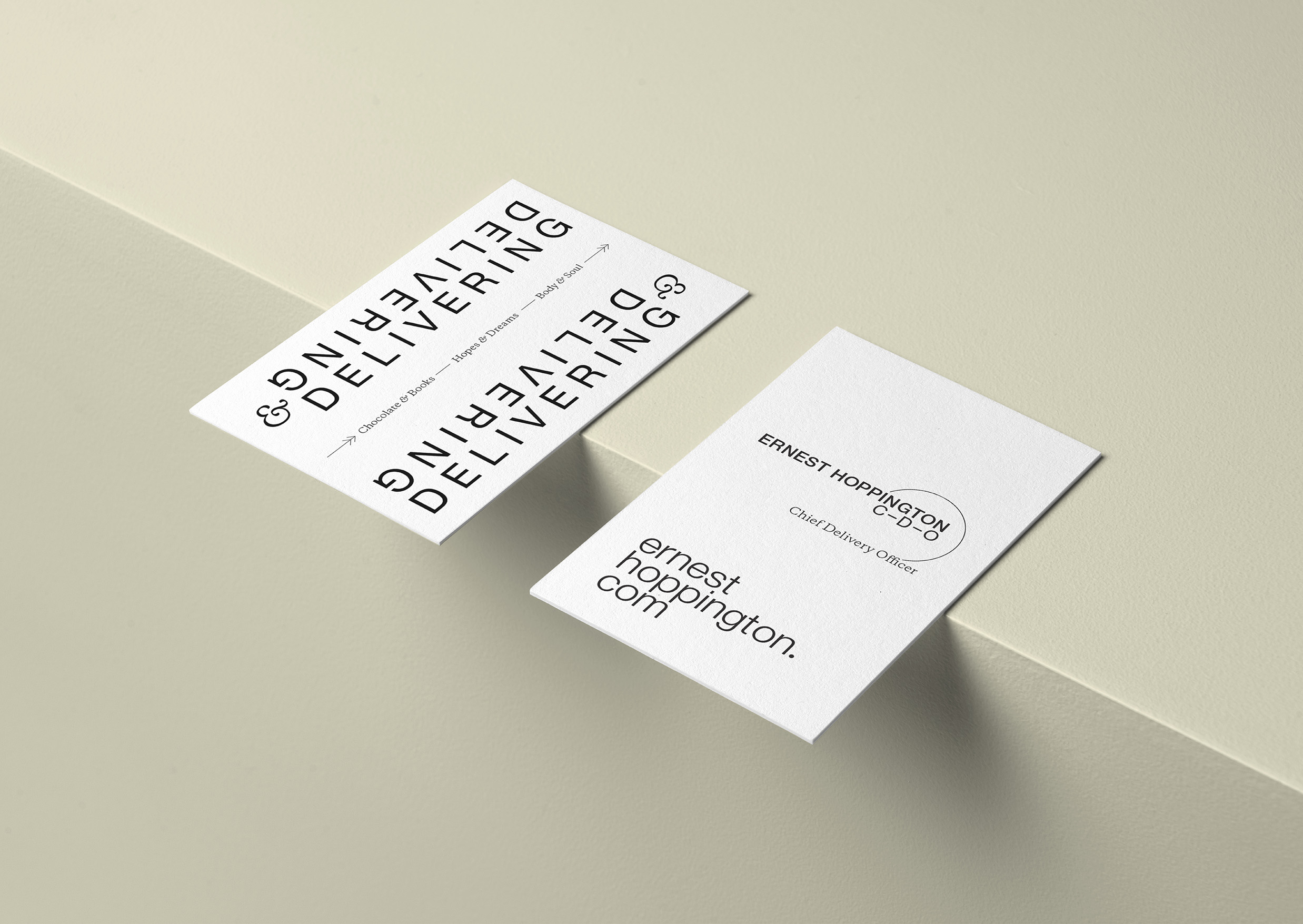
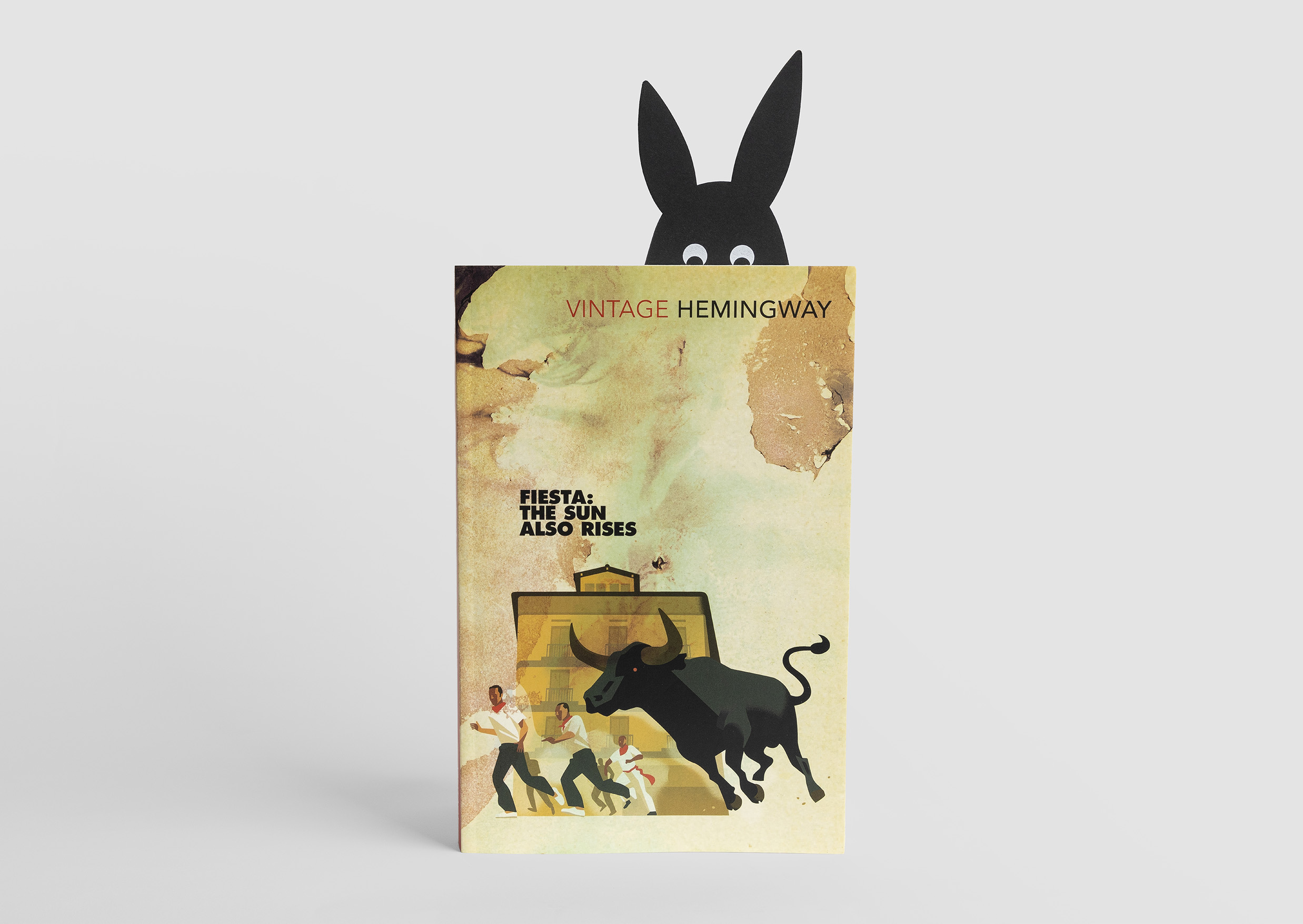
Step up Ernest Hoppington (inspired by Hemingway), the Easter Bunny’s alter-ego. Like many, Ernest’s had to pivot his business in response to Covid. As well as delivering easter eggs, Ernest’s now leveraging his network of bunnies to deliver books. After all, look how well that’s turned out for Jeff Bezos!
Books were chosen because they can be enjoyed in or out of lockdown, shared across ‘bubbles’, enjoyed over Easter and in times beyond. They’re also a relaxation activity, just the tonic for turbulent and unsettled times. And of course, reading is a creative pursuit that aligns nicely with the role we play in our clients’ lives.
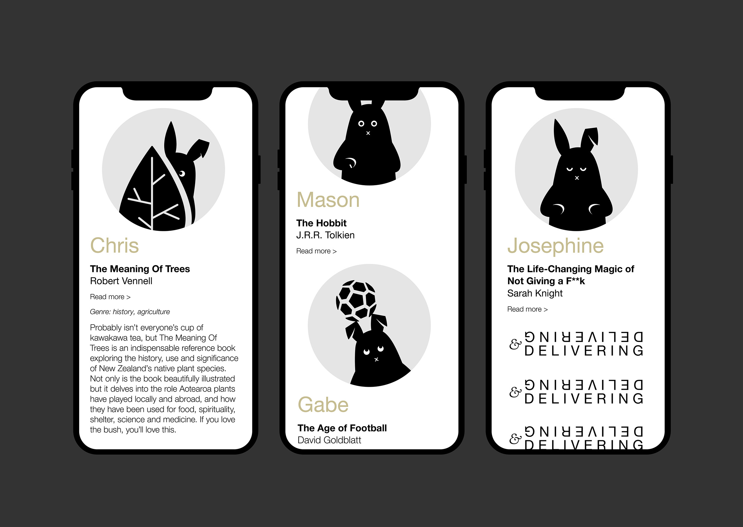
The central idea was to deliver a shared digital experience, immune from further lockdowns, working from home or other Covid consequences. At its core, the experience is a dedicated Ernest website containing a list of great reads recommended by our team. Two user journeys – physical and digital - were developed to drive clients to the website.
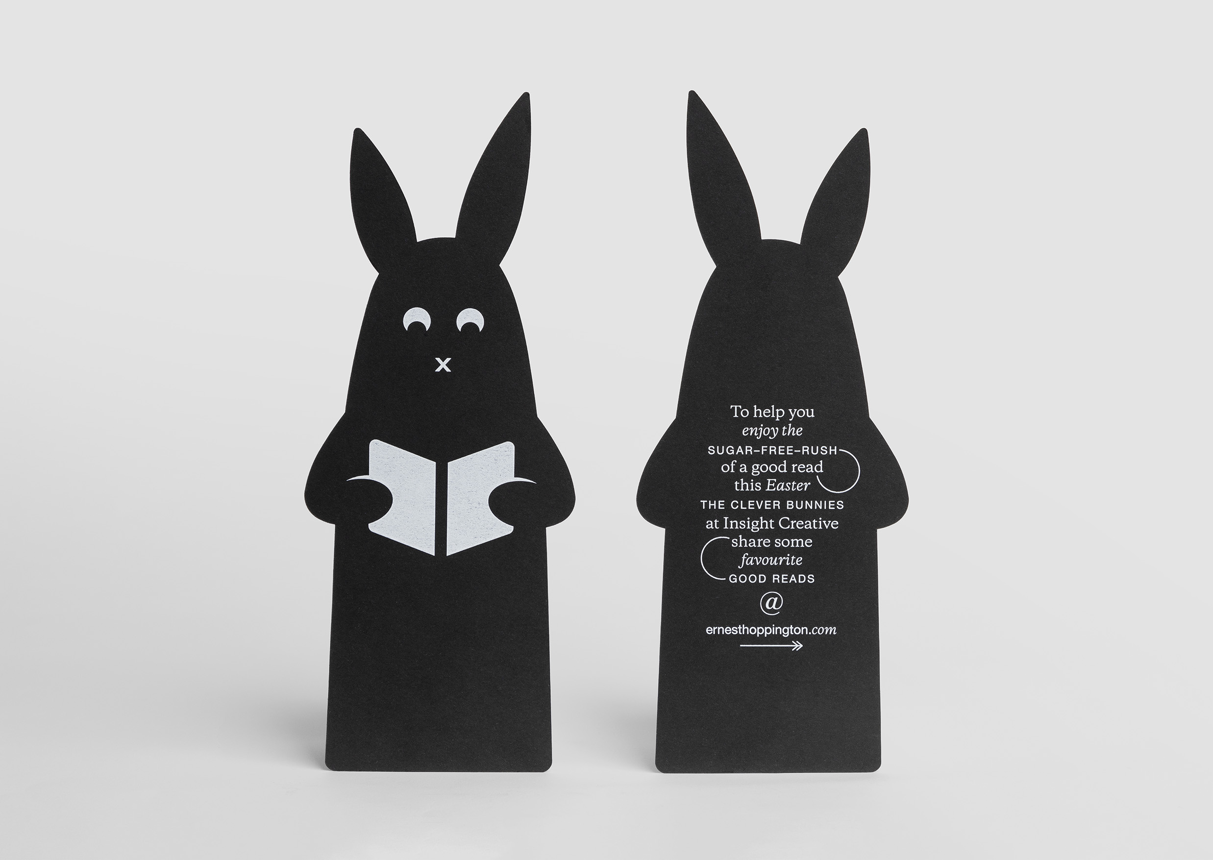
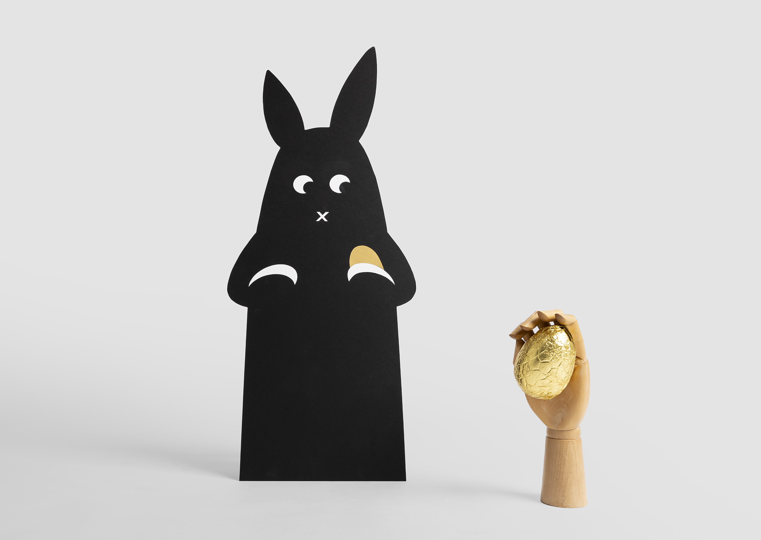
- Clients who visited our offices, leading up to Easter, were greeted by a 75cm high desktop Ernest, paired with a bowl of golden eggs. Each client was given an egg and a bookmark, expressing an Easter message and pointing them to the website.
- For most clients the experience was delivered through a cleverly animated eDM, teasing the full story and driving clients through to the website.
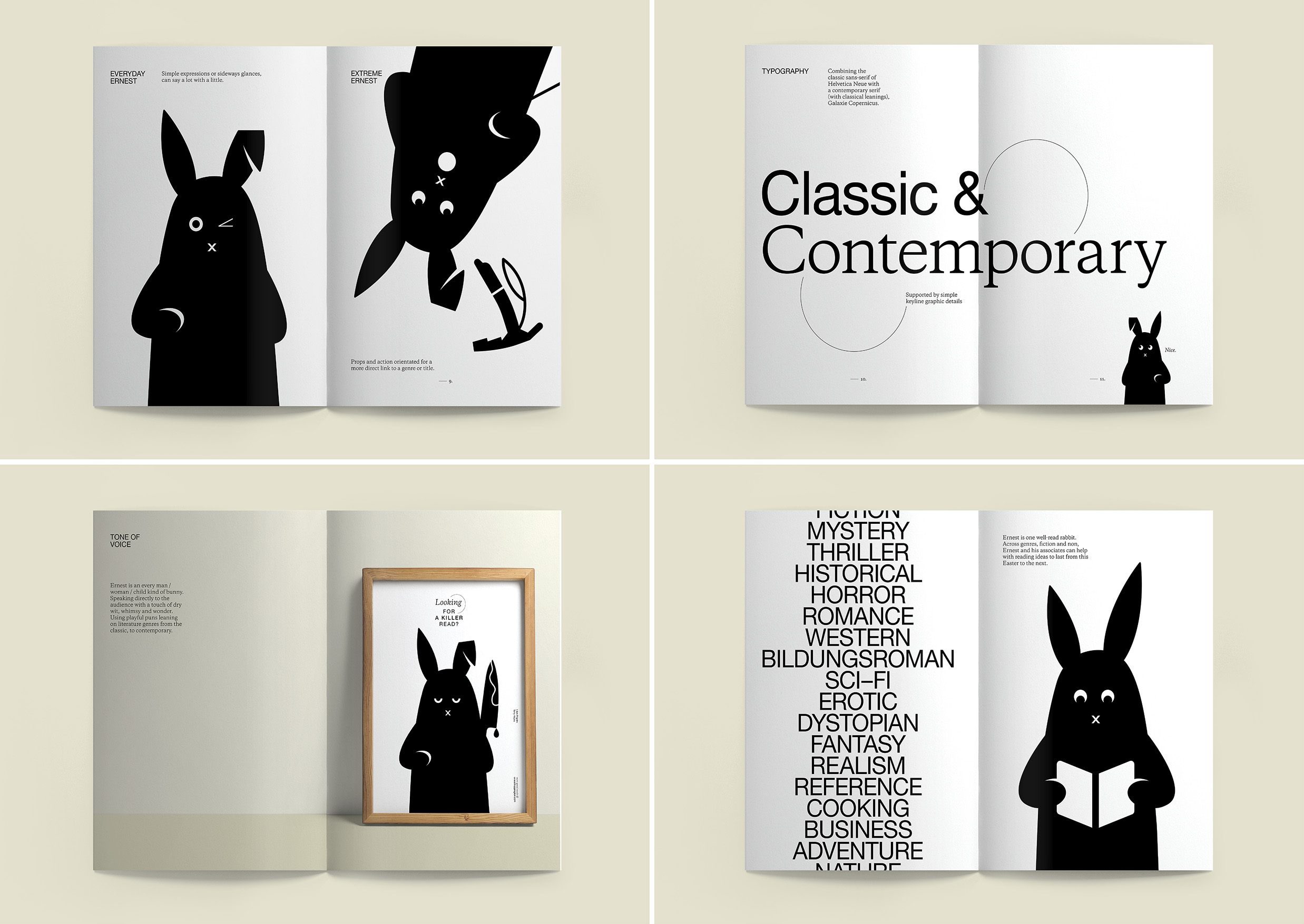
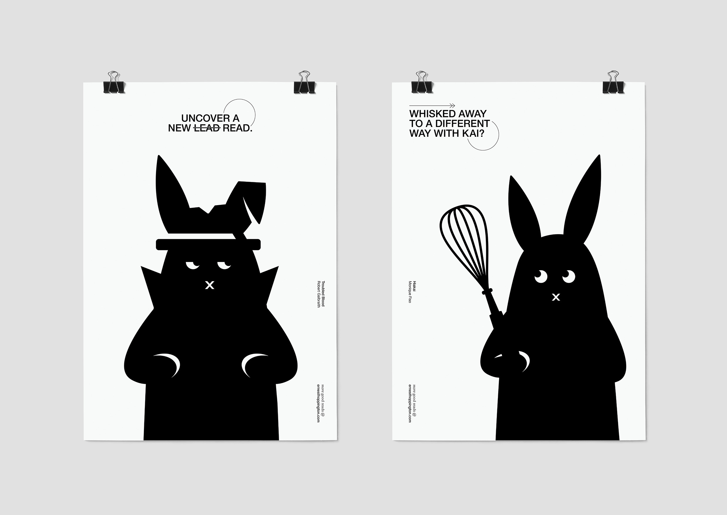
Different design expressions for Ernest were explored from fully-illustrated cartoon to fine-line characters. We landed on a simple, black and white graphic approach, with only a few hardworking expressions. Keeping the character flat and on one plane, and without the complication of legs or tail, also added to the simplicity.
This simple, yet bold, approach enabled further graphics and animation to be used to express Ernest’s personality and to tell his stories. Each story reflects the circumstances Ernest finds himself in or something about the genre or theme of book being recommended.
A black and white (with a touch of gold) palate was adopted to talk to the world of literature. Combining a contemporary serif and classic sans serif fonts delivered a playful approach that further enhanced the literary tone. This feel is reinforced by supporting graphic elements, developed in the same simple, flat style as Ernest.
The Results
Ernest was a hit, rewarding us with lots of positive comments from our clients. Many commented on the funny and light-hearted twist on a traditionally heavy message. Others praised the clever design and storytelling, the well-considered integration of physical and digital elements and the very relevant promotion of reading.
Many clients visited the website and some even took up our ‘good reads’ advice, making Ernest a very happy bunny indeed.