Signalling a sea-change
Client: Comvita
2024 INTERNATIONAL DESIGN AWARDS (IDA) - SILVER
2024 INTERNATIONAL ARC AWARDS - BRONZE
Opening the door on a different future state as Comvita firmly repositions.
The Brief
This was the pivotal year for Comvita. The three year turnaround strategy was virtually complete and the following explosive-growth phase was mapped out but only beginning to be implemented. Despite three years of delivering on strategy promises, the final proof of the new management’s driving plan was yet to come.
The task of this report had two key goals: to remind stakeholders of promises kept; and open the door on what was in store.
The Solution
After a carefully planned three year communication strategy that meticulously tracked promise and performance sticking to a very consistent format which gently evolved, it was now time to signal a sea-change. At the same time, there needed to be structural elements of reassuring consistency.
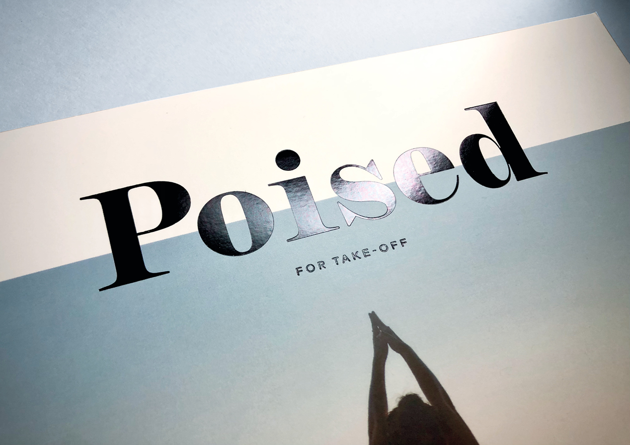
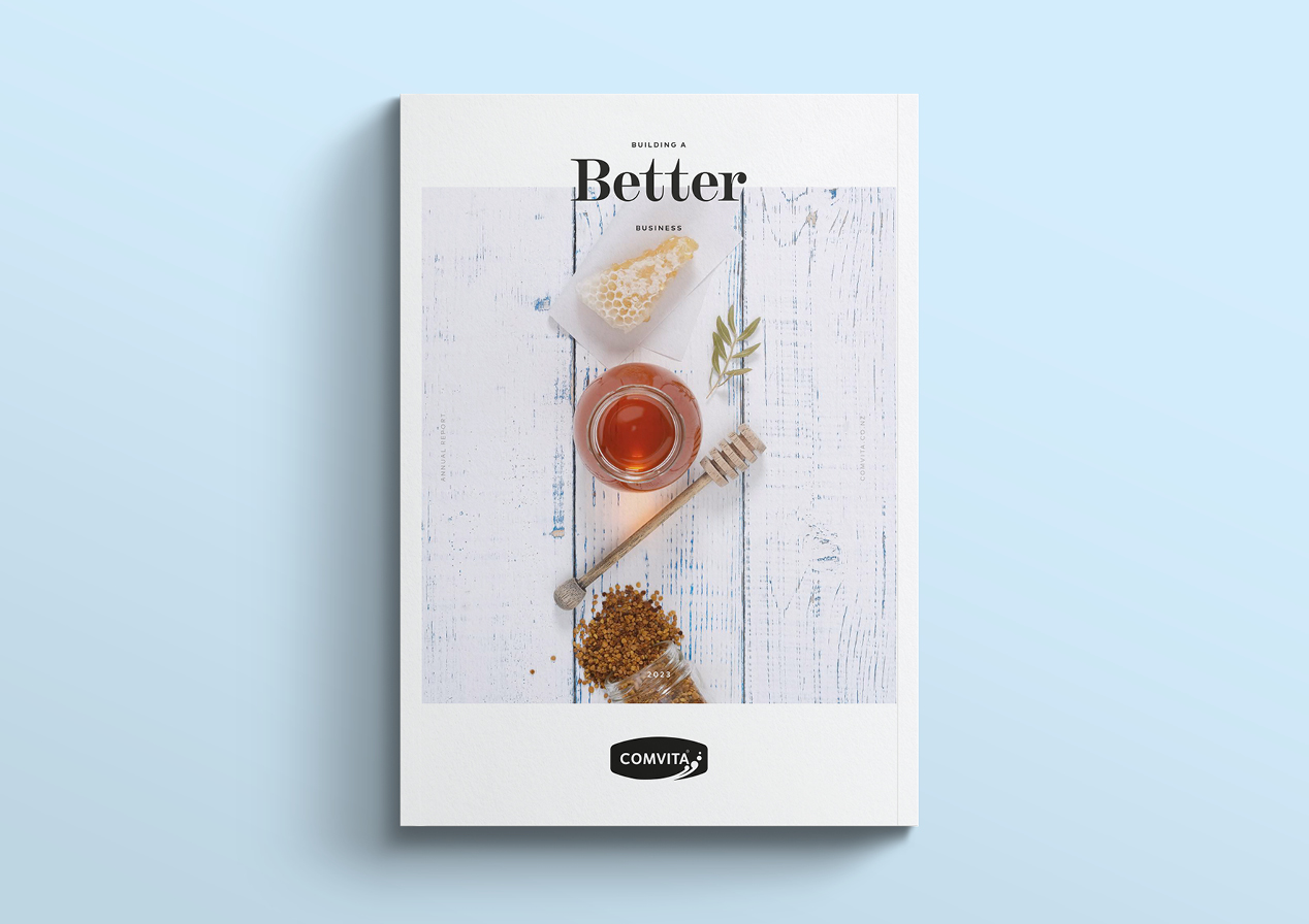
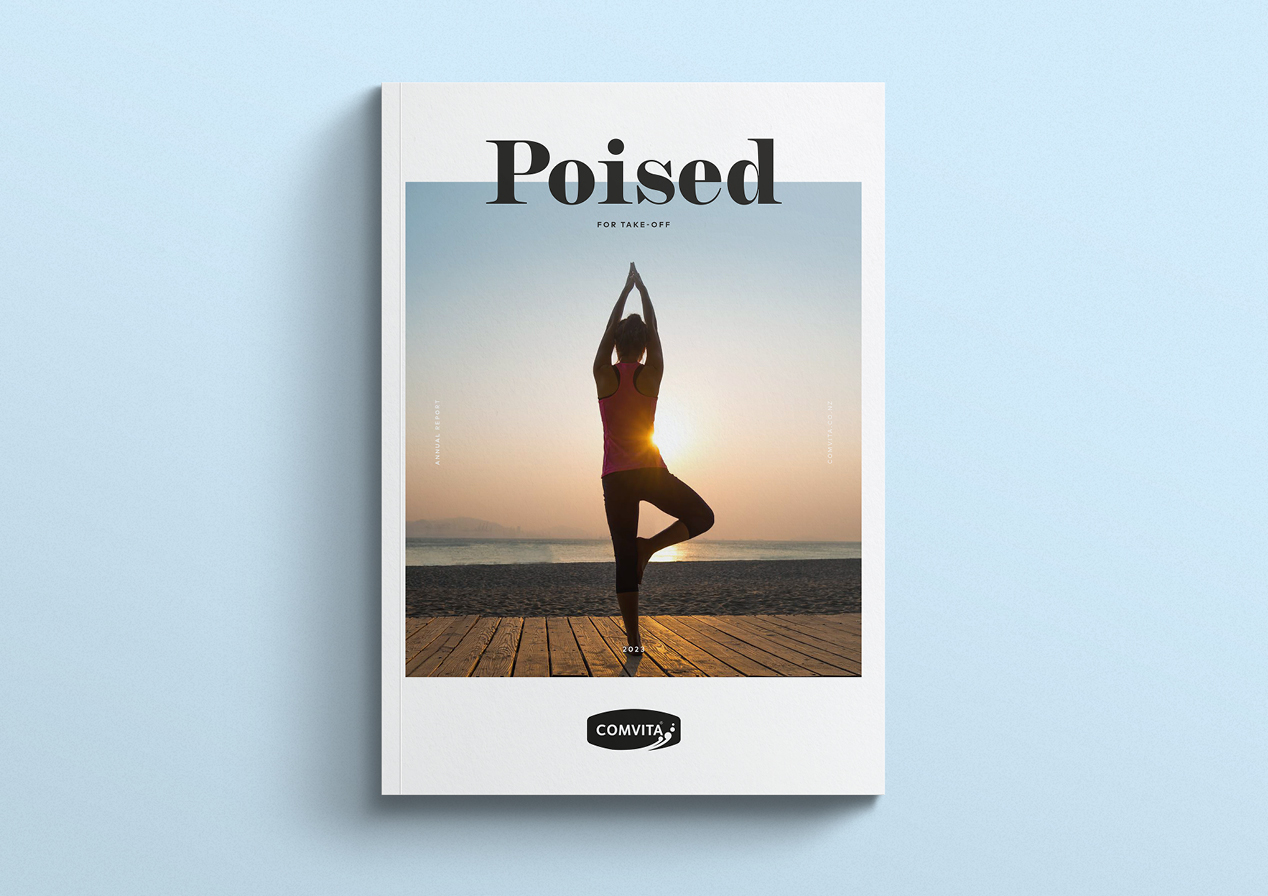
The cover was the right place to powerfully signal the future state of Comvita and to make a clear break from the turnaround phase style consistency. It has long been the intent to shift Comvita from an agri-based food production business to a high-value lifestyle and wellbeing brand, and being on the brink of delivering the products and marketing to deliver that allowed us to make such a visual shift.
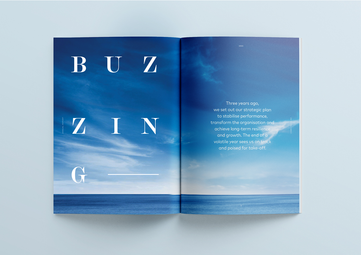
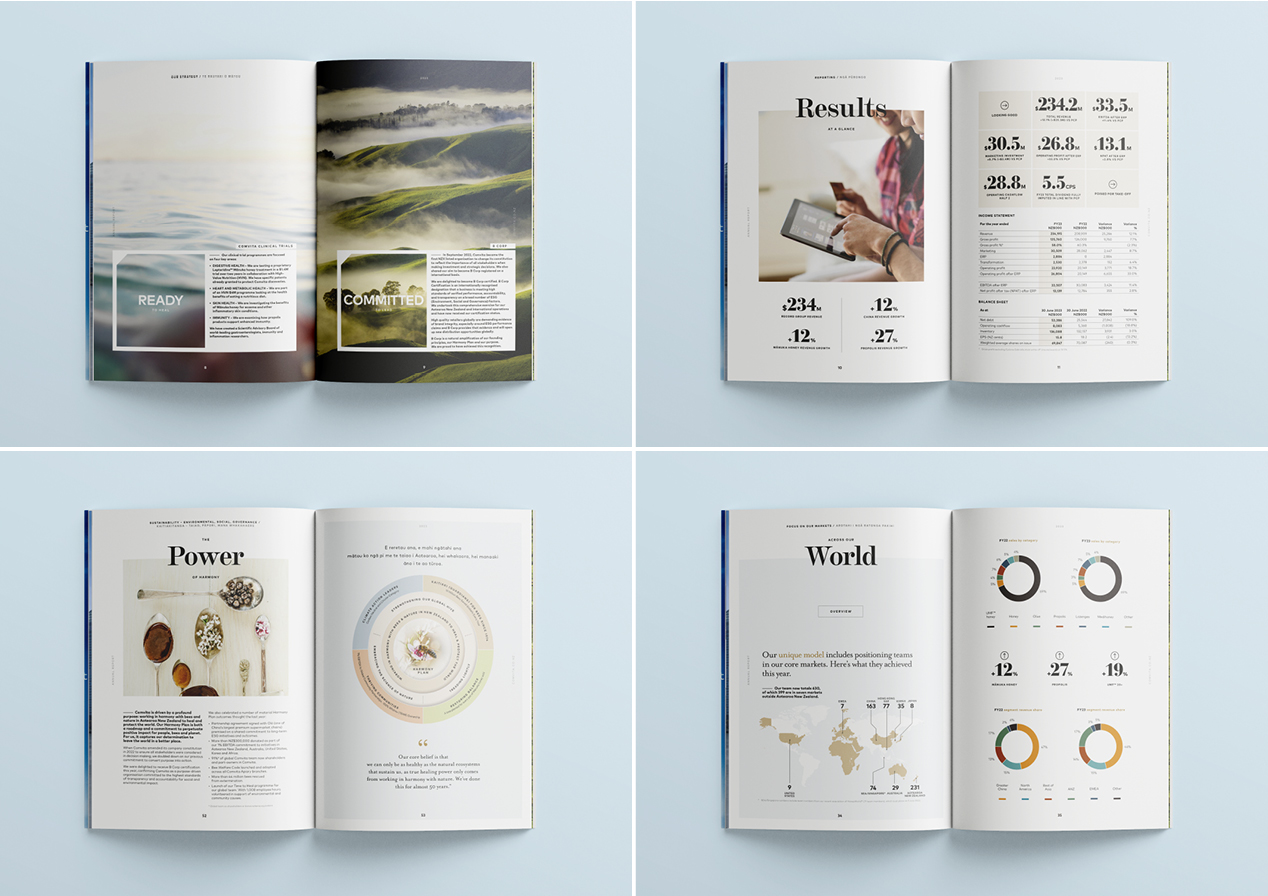
The adoption of a contemporary ‘lifestyle magazine’, FMCG feel was our approach. High on style and impact. A black foil was used on the ‘masthead’ to emphasise intent overlaying a calming health centric image of new possibilities and opportunities. This then led into a literal ‘blue skies’ and new horizons opening spread that acted as a high impact visual and intellectual pivot point on who Comvita is today.
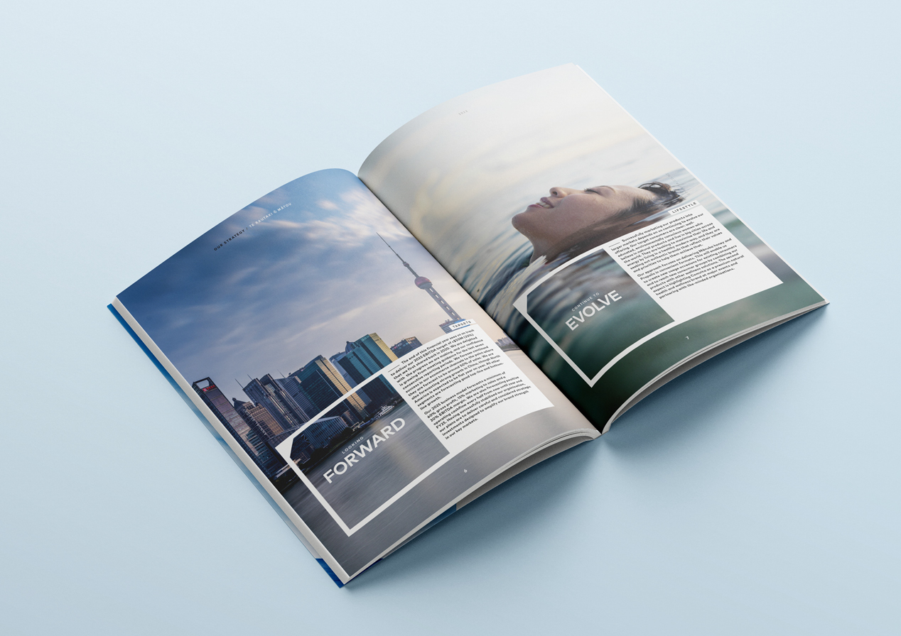
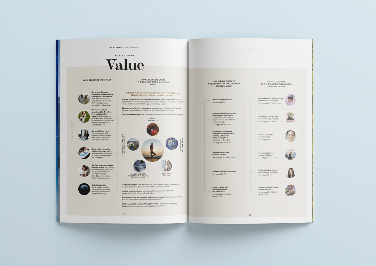
Having set that scene on the cover and opening spread, we quickly but briefly returned to evidence mode, reporting back consistently on the achievement of the earlier 3-part strategy before providing an outline of how the step-change would unfold. Once again through high impact emotive imagery and succinct storytelling that aimed for a positioning that is authentic, co-ordinated and excited.
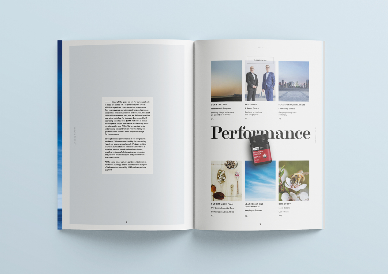
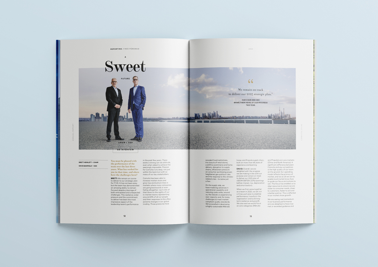
From here on, the report moved closer to the style of recent familiar reports, with the aim of achieving the optimum balance of the exciting future state and the deliberate and conscious step-by-step building on the foundations of the past three years. The Chair and CEO are pictured on an horizon that bridges Comvita’s two key markets (USA and China) with the inclusion of Singapore as their most recent market acquisition. Again demonstrating a savvy business going beyond the agri-business perception to global lifestyle player.
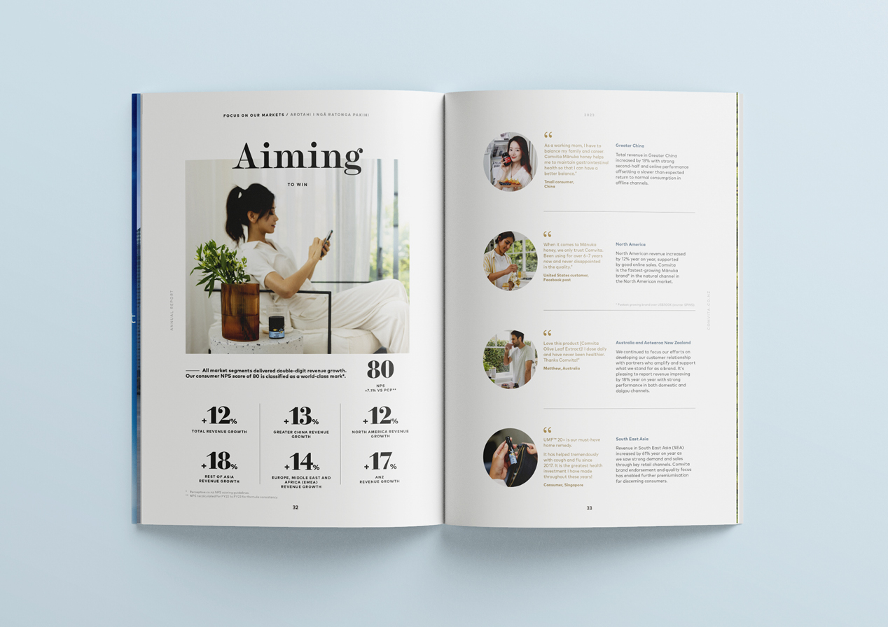
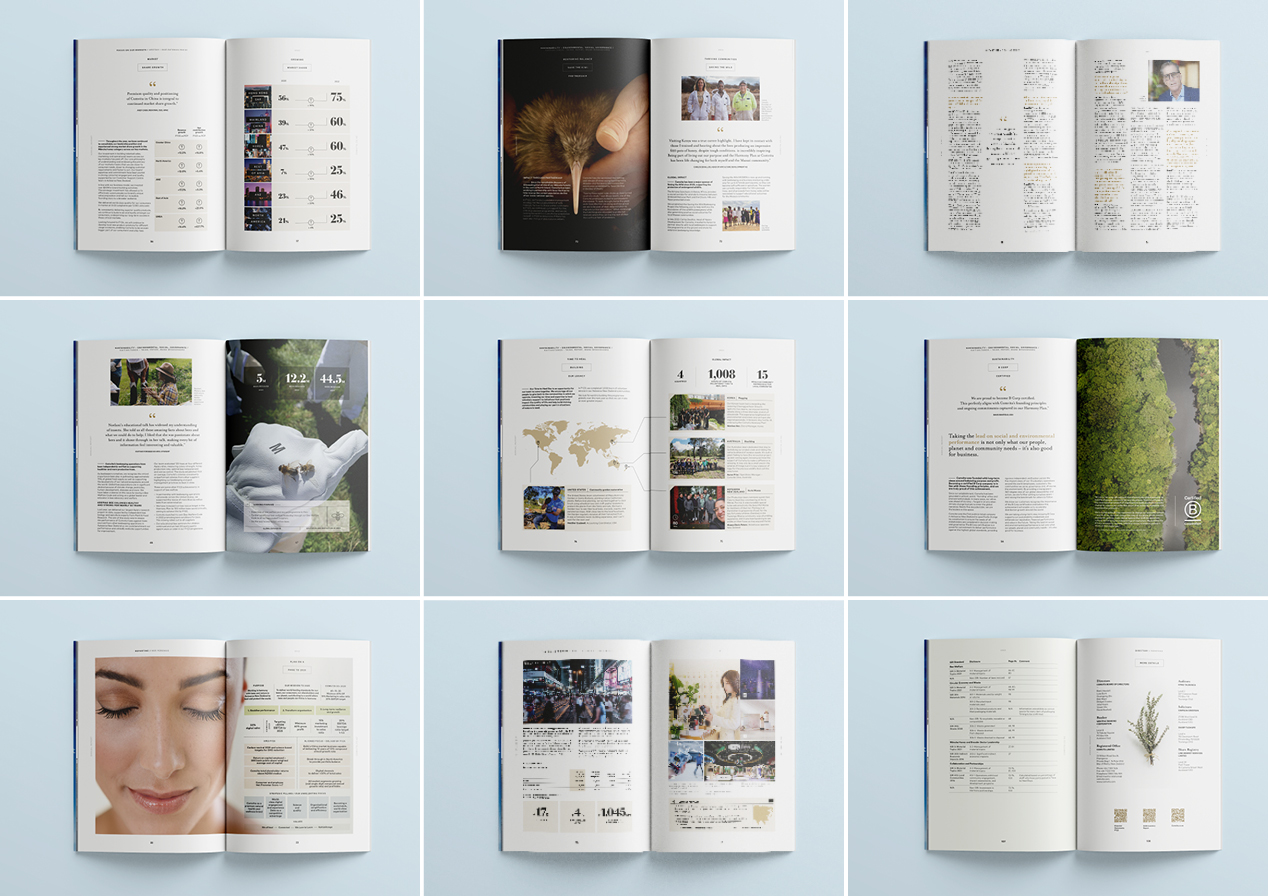
After the full and frank disclosure of sales and performance data for each geographic region and ecommerce, equally transparent information on the highly integrated sustainability strategy was presented including ESG coverage. Each design decision such as typographic grid treatments, typography, colour palette, infographics and image selection was underlined by a territory focused on delivering towards success.
From cover to cover, Comvita’s confidence and simmering excitement about the future is evident as they build a better business.
The Result
While it is taking a frustrating amount of time for Comvita’s share price to catch up with the performance reality, in all other aspects the company is firmly delivering for its wide range of stakeholders. The sure and steady transformation to a global lifestyle brand is a key part of encouraging this recalibration of Comvita’s positioning – and this report is designed to be a clear step to lead that evolution.
