Branding for the right outcomes
Client: Argosy Property
Re-imagining the visual identity for Wellington’s iconic NZ Post House has successfully positioned the upgraded building as a desirable waterfront business address.
The Brief
As part of a complete building upgrade, property owners Argosy asked us to develop an identity for 7 Waterloo Quay. This iconic Wellington building, best known as ‘NZ Post House’ is very much part of the city’s history and architectural fabric. Argosy asked for a modern identity that would position the building as a desirable waterfront home, helping attract quality tenants, worthy of the extensive investment in the building’s revamp.
The Solution
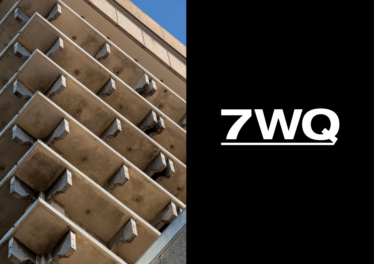
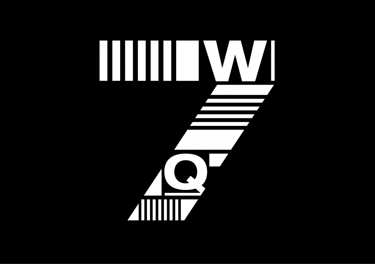
Informed by a request from the Council to clearly show the street number for the property, a simple naming solution became the first design decision proposed: 7WQ – 7 Waterloo Quay.
The single-minded design idea was Modern Heritage, a celebration of the architecture style as the driver of the visual identity. It’s a beast of a building and the identity leverages this brutalist style by celebrating the honesty and simplicity in the materials and construction style.
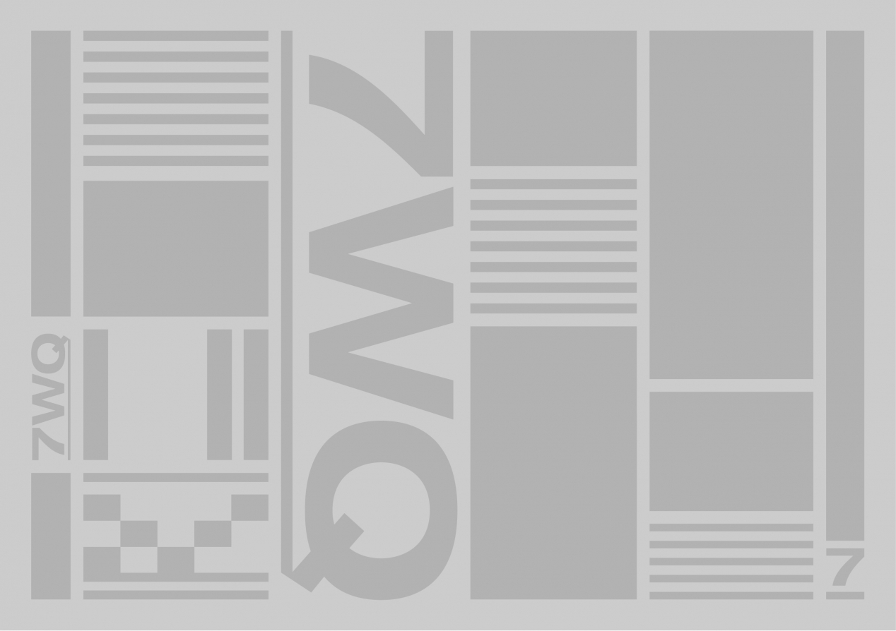
Graphic elements underpin the brand identity, informed by the building’s structural slabs of concrete, steel and straight lines. The typography uses extended and regular weights of Helvetica Neue – selected because it’s a brand font for Argosy and for its sense of architectural efficiency and function.
The graphics that form the 7 are drawn from proportions and shapes found in the building’s exterior façade. In the graphic language there are repeated uses of 7 elements, creating subliminal reference to the building’s design. Images of the building are used as a textural element, capturing the concrete use, and the repeated graphic nature of the building itself.
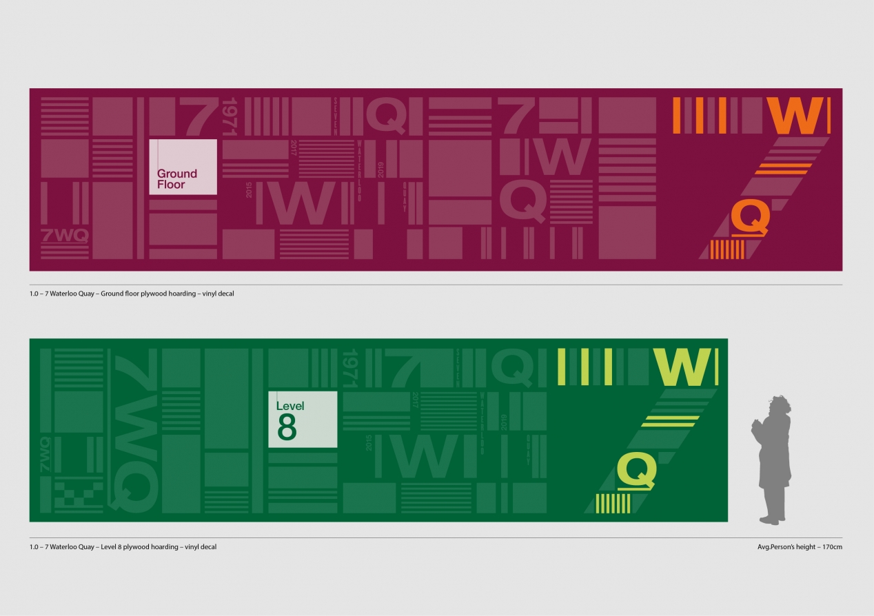
The graphic identity was initially designed for application on highly-visible temporary hoardings and plywood panels that screened construction areas and access. With significant foot and vehicle traffic, these oversized billboards kicked off the process of embedding the new identity. This design work was further developed into feature building signage, profile booklets, posters and other pieces to help communicate the change and to further cement the new 7WQ identity.
The Results
The end result is stylish and considered with a strong design aesthetic and a vernacular that speaks across architecture, history and art. Already the 7WQ language has become embedded, helping inform the next stage in the building’s iconic status.
The building upgrade, together with its new positioning, has successfully attracted a variety of new tenants from large government departments through to a variety of corporates. The client loves the way the building is the hero of the visual identity, and more importantly, how it contributed to attracting the right tenant outcomes.