City identities are expressed in many languages
Client: Albury City
AlburyCity Council asked us to develop a cohesive identity that expressed the personality of the city and where it was heading.
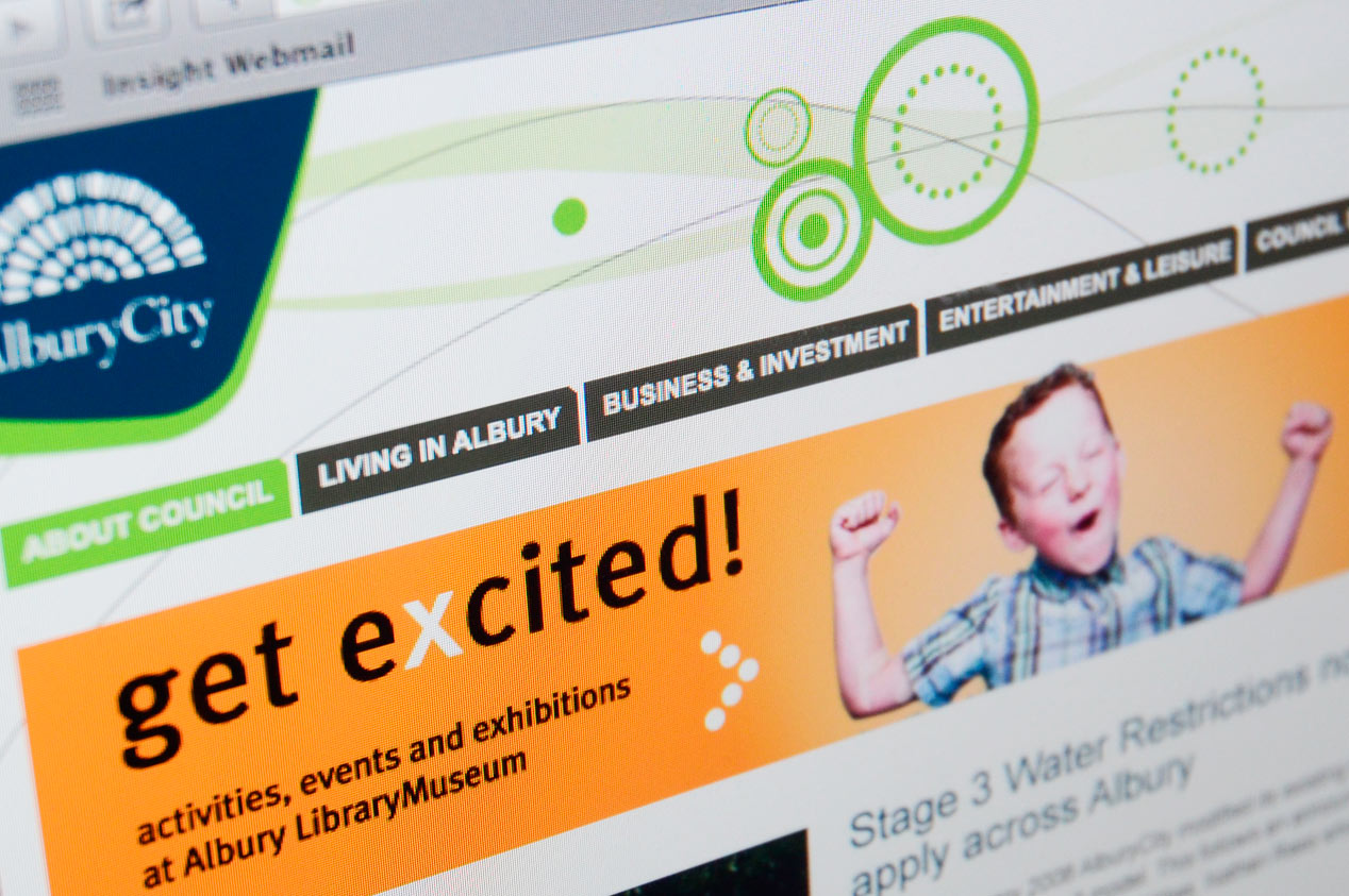
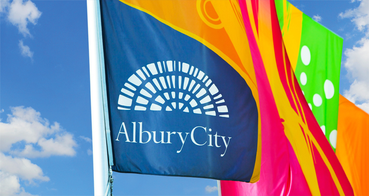
The real challenge was to develop a visual language that could translate this identity across a breadth of applications – everything from council notices, arts, sports and culture facilities, street signs, websites, promotions, events and so much more. Our expression of AlburyCity as an Australian Oasis allowed a large, flexible, living brand to evolve over many years and many executions.
The Brief
Albury’s inhabitants live, work and play on the banks of the Murray River. Located in the middle of the Melbourne/Sydney/Adelaide triangle, Albury offers the best of rural and city living. The local Council established a strategy and vision for the city and asked us to underpin this with a visual identity that consistently expressed what the city stood for today and where it was going. The core challenge was to develop a flexible brand that worked across many touchpoints and could evolve as the Council’s plan came to life.
The Solution
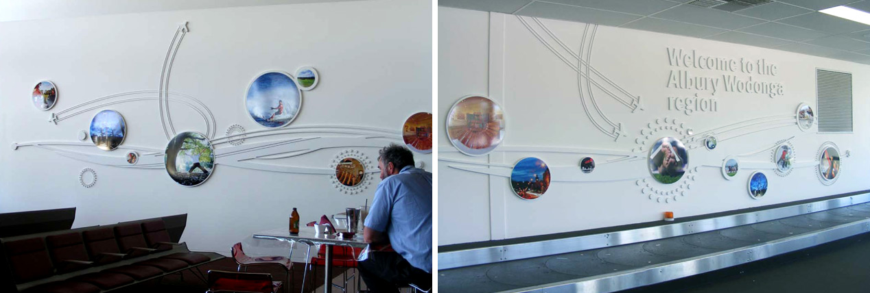
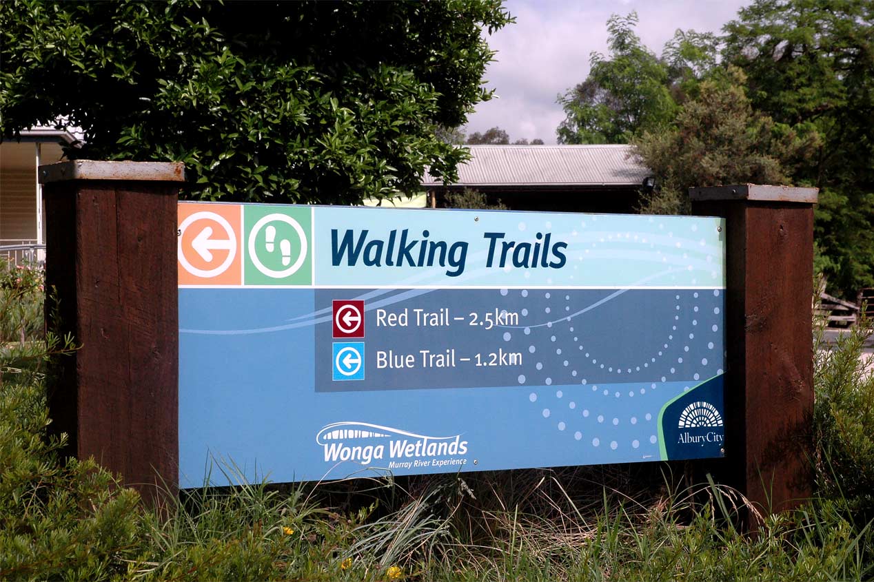
Following a workshop to really understand the brand proposition, we developed the concept of an Australian Oasis. Informed by Albury’s location, the colours and textures of the land and its people as well as the rhythm of the Murray River, this concept was expressed visually by the idea of Albury as ‘a crossing place’ where people, nature and ideas come together.
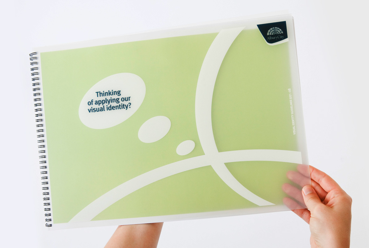
The existing logo was made to work harder by anchoring it in a housing device that allowed both consistency and flexibility. Along with a nature-based colour palette, typography and a series of locally inspired graphics and textures, these elements combined to form a brand toolbox.
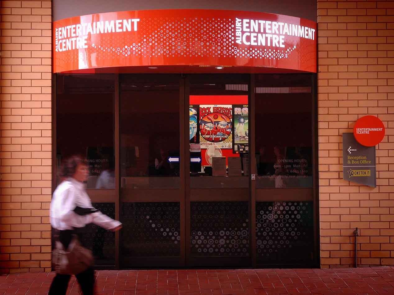
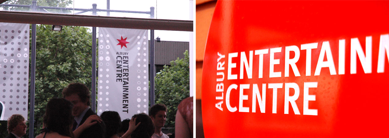
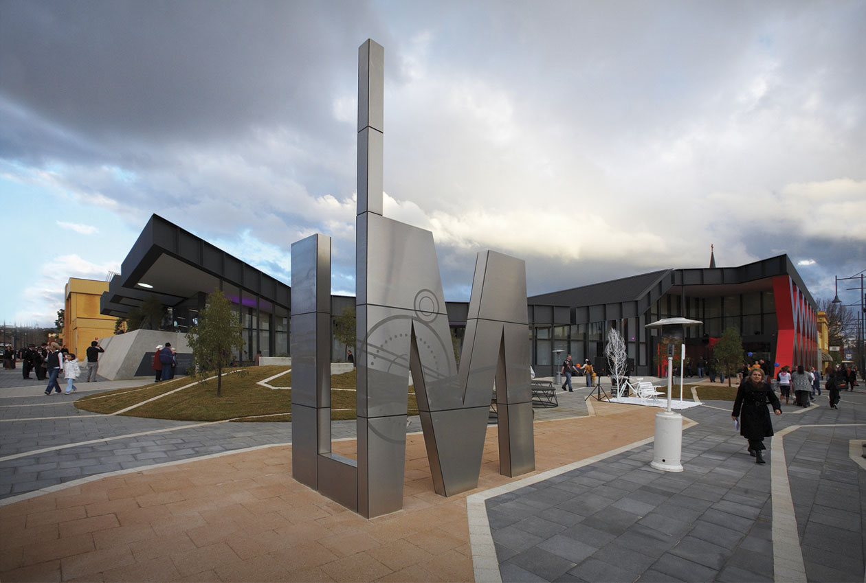
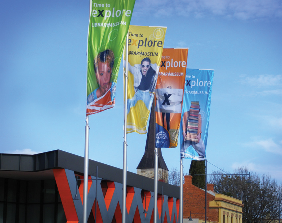
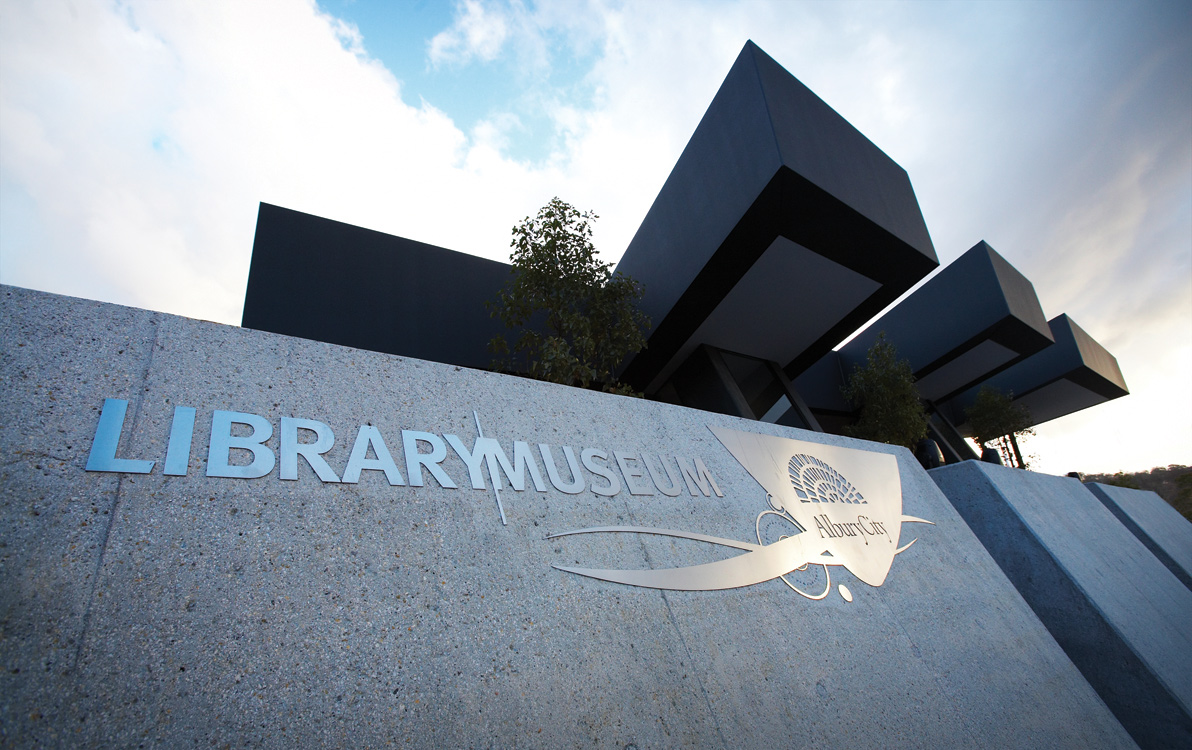
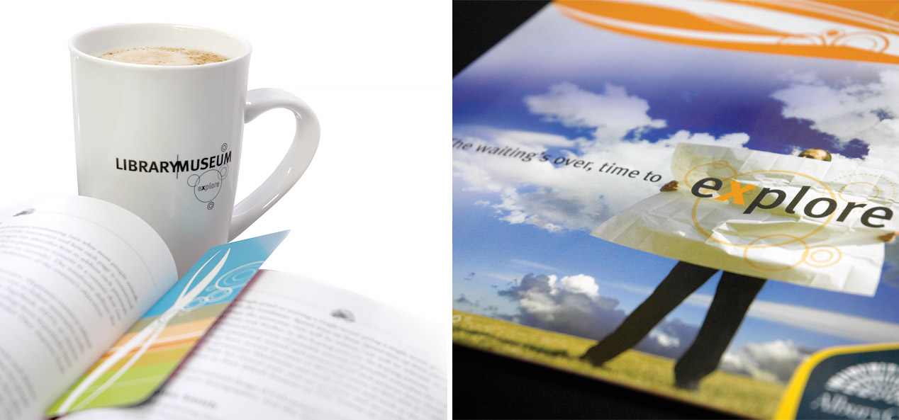
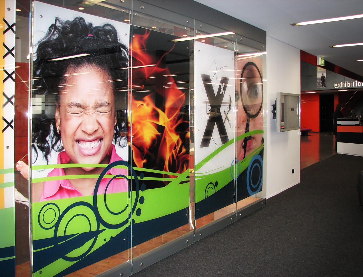
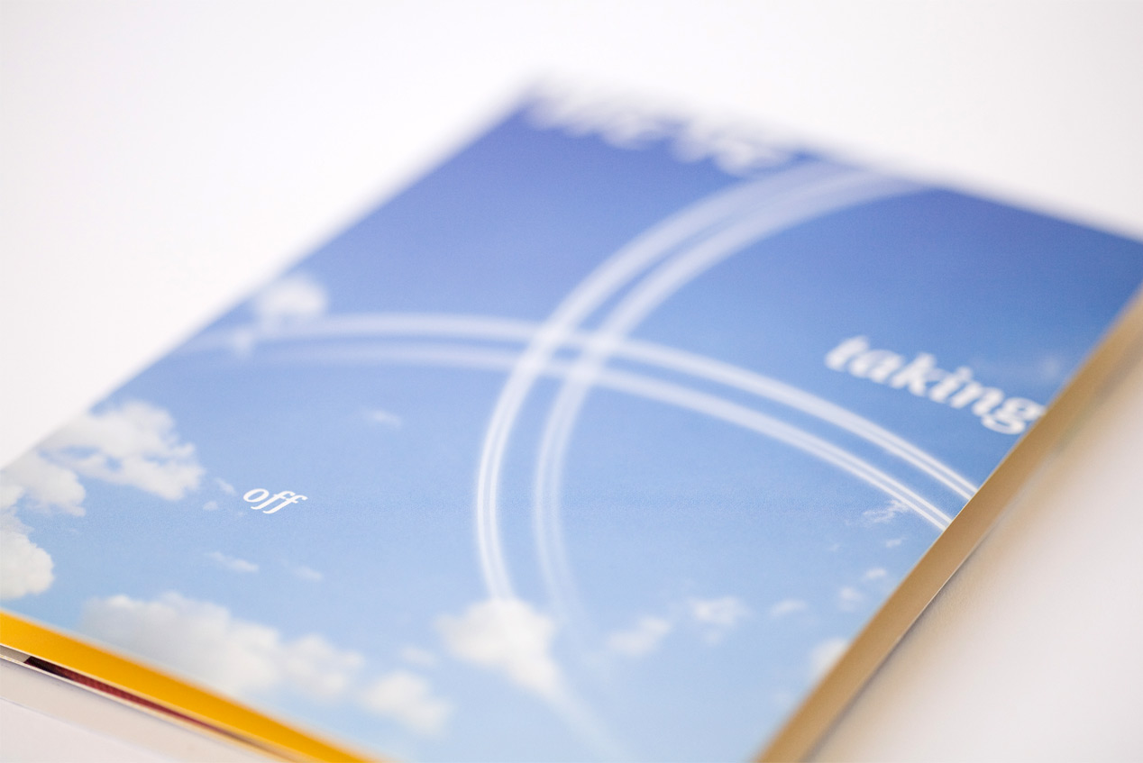
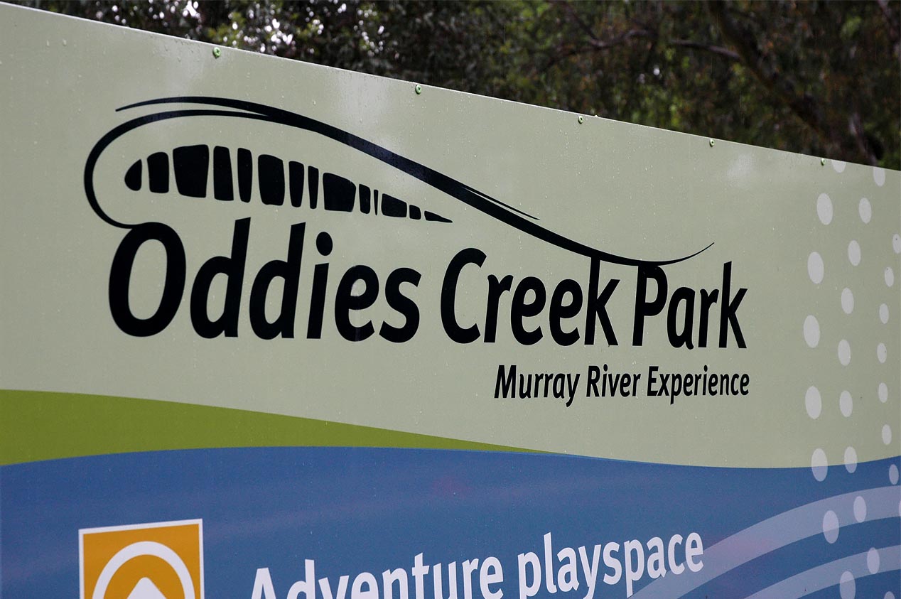
The next step was to apply the tools across the spectrum of core applications including notices, stationery, templates, banners, brochures, uniforms, invites, signage and web. This extended to a facility identifier system and numerous sub-brands. Over the years, these same brand tools have been applied to develop further cohesive but unique identities for an industrial park (Nexus), sports grounds, event centre, the Museum Library, airport, a youth brand, a tourism brand (with neighbouring Wadonga) and many more applications.
The Results
The initial identity work was started in 2007. Today, there is a consistent (but not uniform) look and feel to the brand. The robust thinking and flexibility built into the brand architecture means the core idea is still in place and new ‘interpretations’ are created regularly.