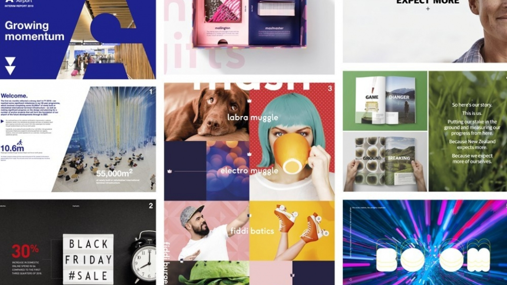
At the heart of our strategic creative thinking are single minded ideas. This week the team explores a few examples of design execution that enhances the idea and brings it to life:
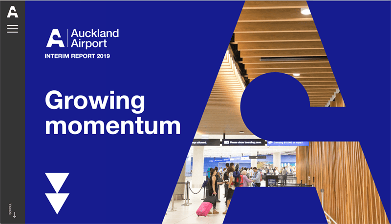
Auckland Airport website
Love the simple parallax movement in this site. The message is clearly embedded in the medium. A well-considered shift from previous years that utilises subtle movement to really good effect. The effective use of the diagonal appropriately enhances the brand ownership wherever you are on the site.
— Brian Slade
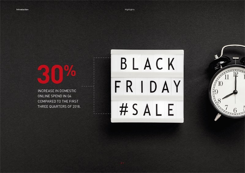
NZ Post ecommerce
Using the landscape format and with selective use of larger, full page imagery this report presents a lot of information with clarity. With the wider strategic-creative thinking informing this, the online report and the flow through to the sales team, the report presents ‘the full download’ feeling very much like a product of the digital environment it’s reporting on.
— Edwin Hooper
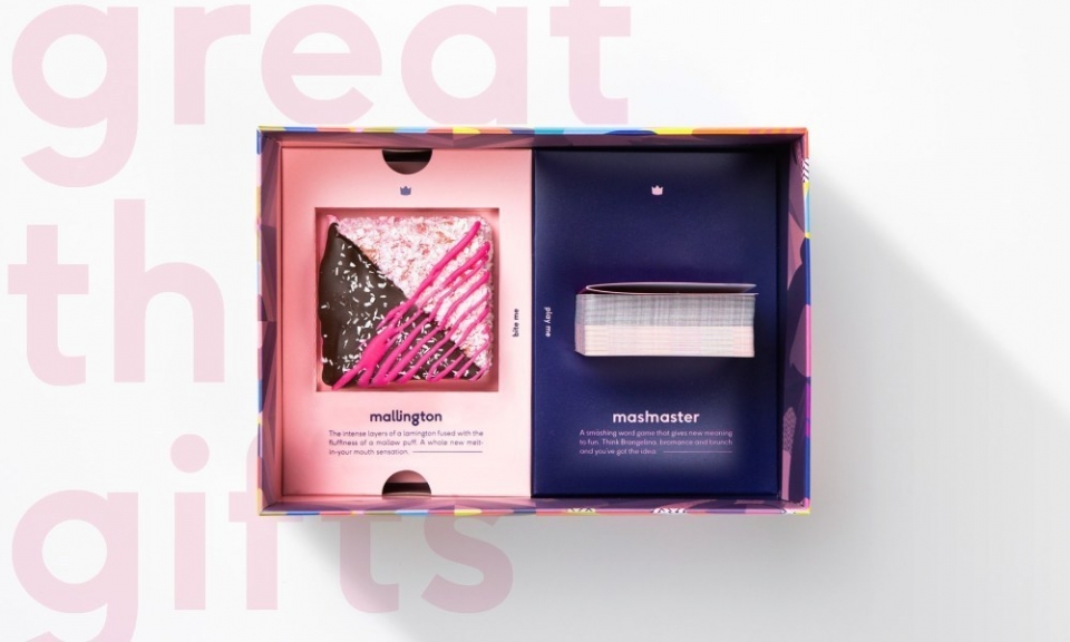
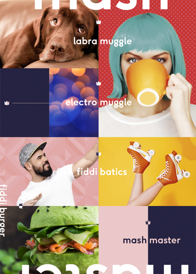
Mashmaster
The main idea behind our end of year gift last year, Mashmaster, played a huge part in informing the layout design. The concept of ‘combinations’ was strongly executed through a half/half layout arrangement across the whole project – from the playing cards, logo marque, brochure insert and packaging, to the Mallington itself, a bespoke cake combination of two coming together as one! Without reading the rules you can get a pretty good idea of what the game is about from the design – a great example of design communicating a message.
— Jo Ross
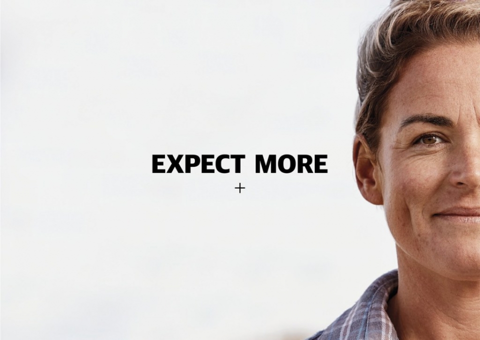
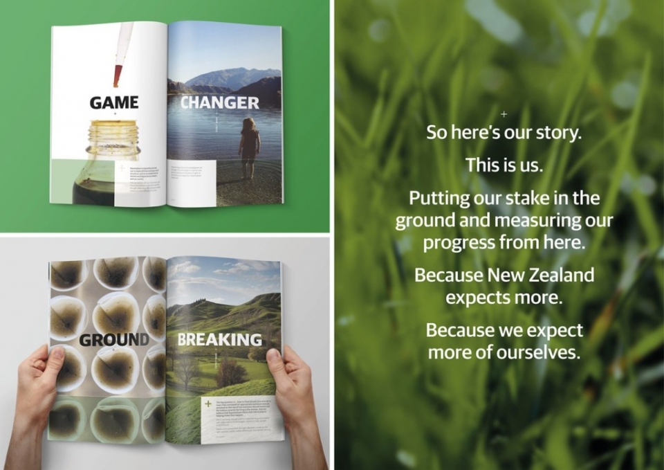
Ravensdown AR 2018
Data-rich content is presented with an ambitious and positive tone on and offline, with clear and straight up comparisons. The theme ‘Expect More’ is expressed thoroughly with the continuous use of the plus symbol as an intimate detail – that detail is then echoed on a larger scale becoming the document’s flexible grid presenting the content through the contrasting panelling of messaging, colour and imagery.
— Chris Gough Palmer

Strategic Notebook 2019
Strategy and creative are the words we live by at Insight. This notebook combines great, thought-provoking imagery, bold colour and clever printing techniques, augmented reality experiences and practical user experiences to create a strong layout design that reinforces these key ideas at every touchpoint.
— Alice McKeown

