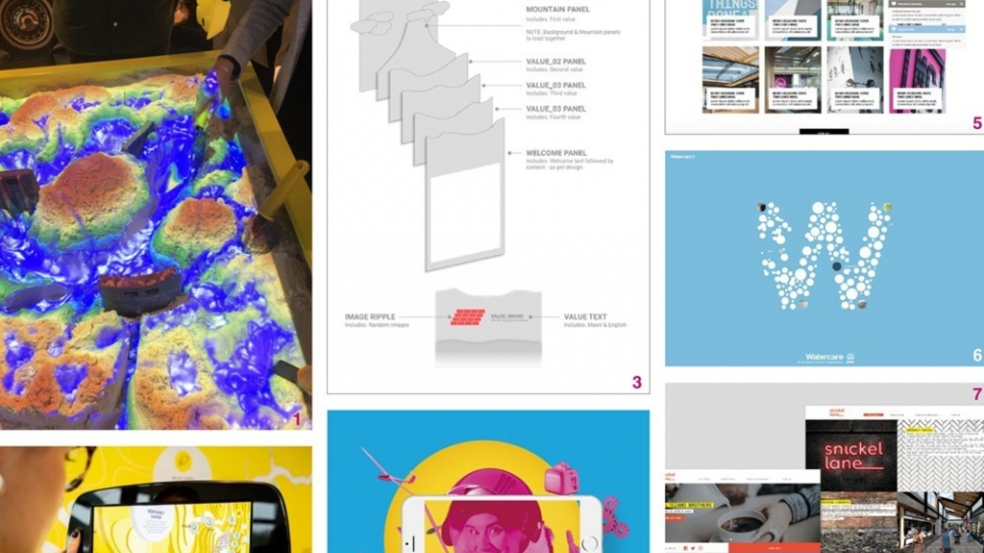
This week our creative celebration focused on Digital Solutions. Augmented Reality experiences, responsive websites, intranets and tactile hands on digital playtime in a sandpit. A variety of creative solutions for diverse user experiences.
Here’s what the team put forward…


Mercury Build Your Own Hydro Network
Love how digital came to life in a very tactile way. I’d never seen technology work like this before so for me this project was a very exciting, delightful experience. Great opportunity to release the inner child and learn by doing.
— Jo Ross

Mercury Showcase – AR waikato river
It was wonderful seeing this at our Insight strategy day. From redrawing the river and contours, to the assorted animated / video / interactive and final AR elements, it brings together our wider skill sets and expertise across the team (and some outside help). A great creative, practical application of AR that will inform anyone from school age to old age about how power is generated and delivered to us all.
— Edwin Hooper

Insight’s AR Wall
What better way to celebrate digital than one of the newer mediums within that world – Augmented Reality. It’s great to work at an agency that prioritises new tech, and learning about it. Spearheading the design aspect of our Spacewoman wall was a lot of fun for me. And at the end of all the thinking and doing from so many people here at Insight, we have two gorgeous static artworks in our offices, which we can play and engage with over the coming months.
— Sarah Turner

Meredith Connell
The MC Intranet demonstrates a really strong design solution showing growth and visual identity evolution. A highly technical and challenging project for the build and a hugely improved user experience. Great solution within tight boundaries.
— Brian Slade

Watercare annual report – online
A great example of how to successfully take a strong print design and apply this to a digital setting. Engaging animated interactions help bring the content to life while warm, people-focused images continue to tell the brand story.
— Alice McKeown

Snickel Lane website
The Snickel Lane website strikes the perfect balance between functionality of a responsive website and an interesting design idea that stands out. The site loads quickly on multiple devices, and draws you in, with highlighted headlines and creative imagery of street food markets.
— Anna Charlett

