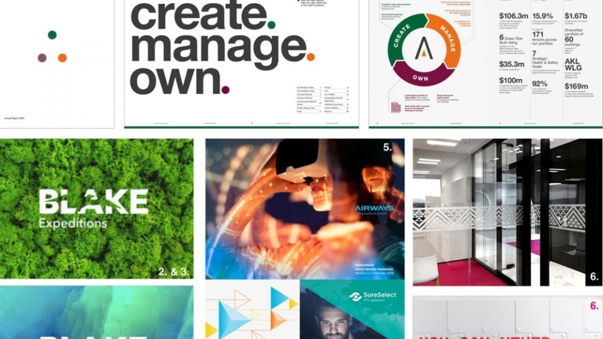
Strategic creative is the sum of two parts, strategy and design coming together. This week we asked our strategy and client service teams to discuss their pick of Insight work that does this successfully.
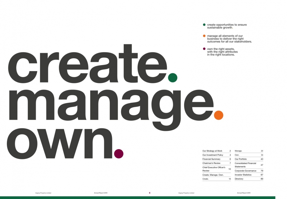

Argosy Annual Report 2019
Earlier this year Argosy did some work around formalising and refreshing their business strategy to ‘Create. Manage. Own.’. The strategy was launched publicly with the Annual Report so this needed to communicate the reset in their approach clearly to shareholders. On the cover, we used a triangle constructed from three coloured dots to create a sense of intrigue. The opening spread of the report then reveals the association of the dots (and colours) to Create, Manage and Own. On the following pages this is explained in even greater detail, with proof points to show how they are delivering on their strategy across the business.
— Claire Evans

Blake identity
It solved a generational change issue but with a super-smart nod to its legacy. It has the versatility to accommodate multiple “products” with strong evocative design. Finally, the creative retained what the organisation and it’s founder have always been about – clear, environmental focus. Plus the use of the albatross into the word is just genius.
— Jason Linnell
This is an exceptional example of clever strategic creative work. We successfully managed to navigate tricky waters (excuse the pun) to restructure their product offering and deliver a world-class wordmark/visual identity that has propelled their organisation forward, while still maintaining important ties to the legacy of their past.
— Gabe Graham
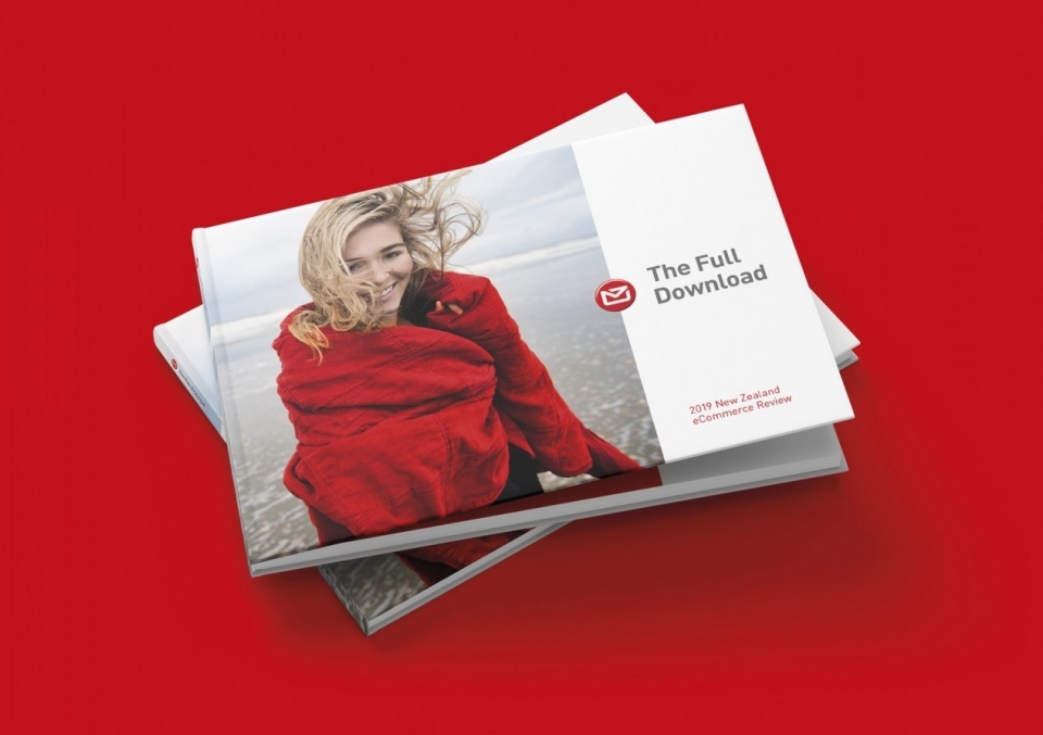


NZ Post — The Full Download
My pick for a good strategic-creative example is NZ Post the full download. As it says in the case study, “our first strategic recommendation was to move to a digital-first approach, with print as the supporting medium”. Sounds obvious, right! It took insight, lucid thinking and thinking big to make it happen. We could’ve done just another printed report, but where is the strategic-creative in that? How’s the client helped by that?
— Paul Saris
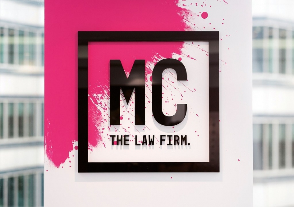

Meredith Connell
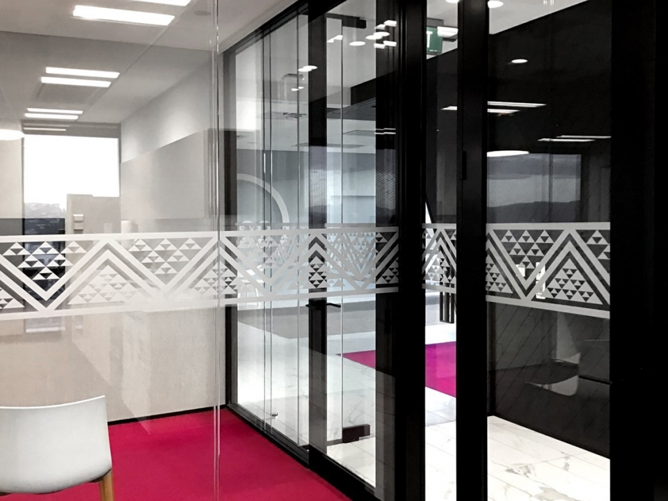
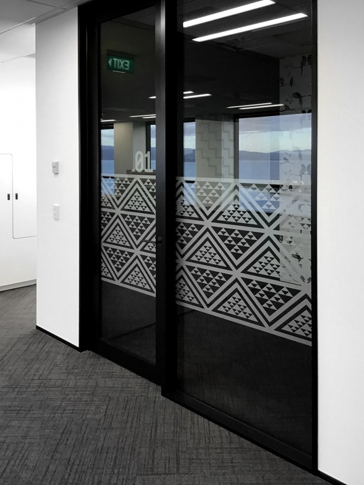
The Meredith Connell rebrand. I felt it was the perfect example of strategy and design coming together to make a major change for a client. It hit the brief and is still going strong 4 years later. We’ve recently done the Wellington office fit-out and are currently working on updating some of the Auckland office graphics. It is a fun brand, full of attitude. Projects like this don’t come across too often and it is always one which brings me joy.
— Monique Wallace

