A recent article in Creative Bloq resonated strongly with observations I had recently been processing regarding the convergence in style of corporate logos in recent years. I reproduce it here, albeit edited and with some of my own views incorporated.
Think logos are all starting to look the same? You're not the only one. While ideally a logo design should aim to be timeless, they do, like anything else, follow trends. The trend in recent years has been towards minimalist simplification. Both fashion and the practical requirements of small mobile screens have led to simpler, flatter designs.
But some people aren't convinced by the arguments for why the trend exists. One writer has proposed his own theories on Twitter, and the thread has gone viral, eliciting thousands of responses. From companies playing it safe or cutting costs to the death of aesthetic diversity, it appears everyone has a theory about why it's happening.
While the debate's not new, developer Radek Sienkiewicz opened it up again with a post on his site VelvetShark. He examines the "sans serif invasion", which he argues is creating a "sea of sameness" in tech and fashion logos. He thinks that since around 2017, brands have started to see "being unique as a handicap" and have decided it was better to be like everyone else.
"Don’t throw away what the brand has been working on for decades," he says. "Otherwise, you may end up in a situation where you could slap any logo on any product and hardly anyone would notice a difference."
Sienkiewicz also shared examples of a series of tech and fashion logos that have changed in recent years. The tech brands he highlights have almost universally gravitated to simple lowercase wordmarks – gone is the jaunty typography of earlier logos from Spotify and ebay. The fashion brands all went uppercase. In both cases, there's not a serif to be seen.
For the tech brands, they at least have colour to tell them apart – and many have a logomark as well as their wordmark, but seeing the logos in greyscale shows just how much they rely on that for their brand identity. However, in the case of the fashion logos, they're almost always used in black and white, making them even more similar in their real applications. "It looked like two huge industries decided to use the services of one designer, and not a particularly inventive one at that," Sienkiewicz alleges.
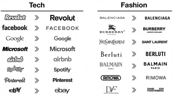
(Image credit: Velvetshark.com)
Writer and podcaster David Perell posted his own theories on a Twitter thread headed with the question, "What's causing all these logos to look the same?" It has since picked up 250k likes, 50k shares and more than 4,500 comments. Perell has two theories to explain the aesthetic homogenisation: 1/ software: that designers are all using the same software and 2/ the internet: that aesthetic diversity is bound to fall in such a hyper-connected world.
Plenty of people agreed. One person responded: "This is what happens when the creative dept is overrun by the marketing dept. Being data driven is the death of art." Another person replied, "Brands are scared to stand out and they don’t want to pay for the time and skill it takes to create a unique logo. Blending in is easier."
User Interface (UI) engineer, Lucas Castro had a different take on the reason. "It's not simply accidental homogeneity: there's a fundamental difference between the objectives of graphic design vs UX design." He notes that in UX, "sticking to convention is a feature, not a bug."
Another person suggested a different theory: "My bet is it’s the clients. You have no idea the number of options these brands were presented. It was a lot! Having been in this business for some time, very few clients have the courage to be different."
I find myself feeling it may be something less conscious than that – a subtle, wider societal influence in which we are unknowingly drifting on a general conformist tide, perhaps? Here in New Zealand, blogger Chris Bray has been pondering a somewhat parallel issue: choice vs free will. He questions:
“did those of us who got into sourdough during lockdown, or decided we really must renovate the bathroom, or whatever we did . . . did we really choose to do so, or were we just ‘following something’. It certainly felt like a choice to us then. We weren’t aware, in the moment, that everyone else was feeding a starter or looking at rain showers. We were doing our own thing. Right?”.
Could it be as simple as an unconscious desire to conform?
Whatever the reason, it’s completely counter to the principles of brand differential, isn’t it? And while Insight isn’t immune to the general trends of the time when designing logos, we’re constantly mindful of two universal truths of marketing:
1/ The purpose of any branding project is to create visible distance from the competitive set, and
2/ Any corporate logo design needs longevity built into it, rather than risk reflecting current design fads.