This week, from the macro to the micro, the team looked at design detail, detail, detail and how it enhanced the idea and experience for users.

Fisher & Paykel AR – 2019
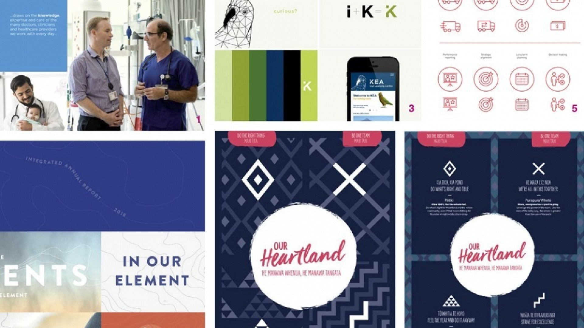
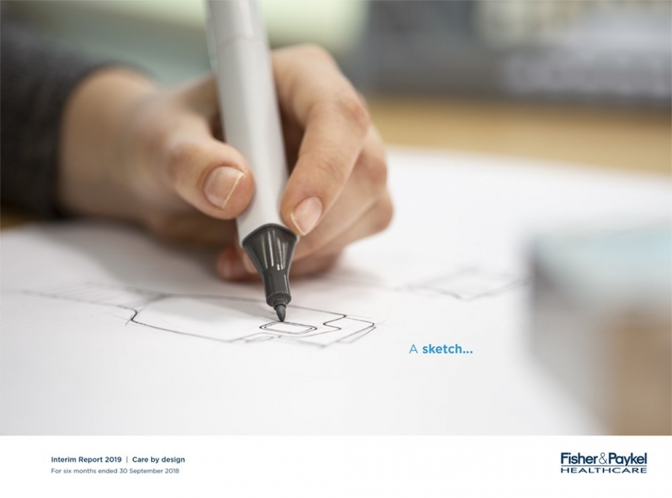
Fisher and Paykel are renowned for their innovative products. This dosen’t just happen by chance and this year we were able to successfully communicated their core idea of ; culture of innovation that drives the business. Through simplified thoughtful design layout we tell a big idea story that links thoughts and narrative. From idea, sketch to patient.
— Brian Slade
Sanford AR – 2018
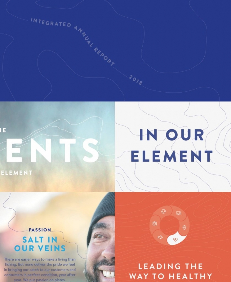
A report with significant data and reporting, its effectiveness seeing it as a recent award winner at the ARA Awards. The design idea, ‘the elements’, related to their relationship with weather, embracing the wild seas as they catch, and changing farming methods with effects of climate change. Subtle isobar elements are used selectively through the report, linking messages on opening pages, to background use on key sections. Like good design detail, should it provides an ‘element’ that can be used in different ways to thread the thinking throughout, to an enhanced result.
— Edwin Hooper

Information is in the detail.
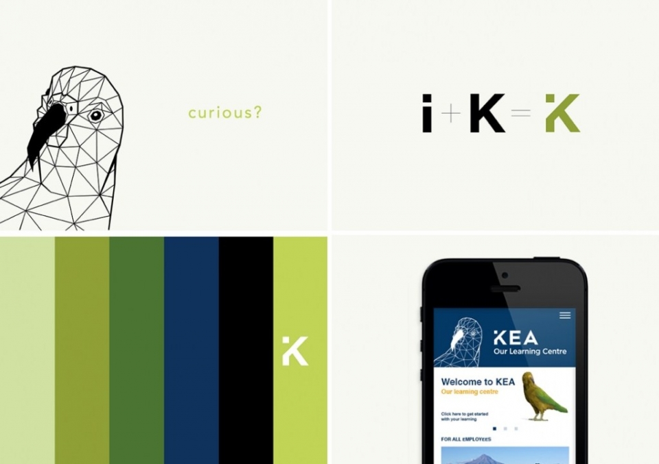
The Kea Learning Centre wordmark is a great example of design detail supporting and uplifting an overall idea. The clean wordmark features a beautifully integrated ‘I’ – and weather you’re aware of the ‘i’ standing for ‘information’ or not, it demands a sense of curiosity from the viewer, creating that enquiry, that overt need for information. The wordmark is therefore a perfect representation of the very essence of the product – the learning management system.
— Chris Gough Palmer
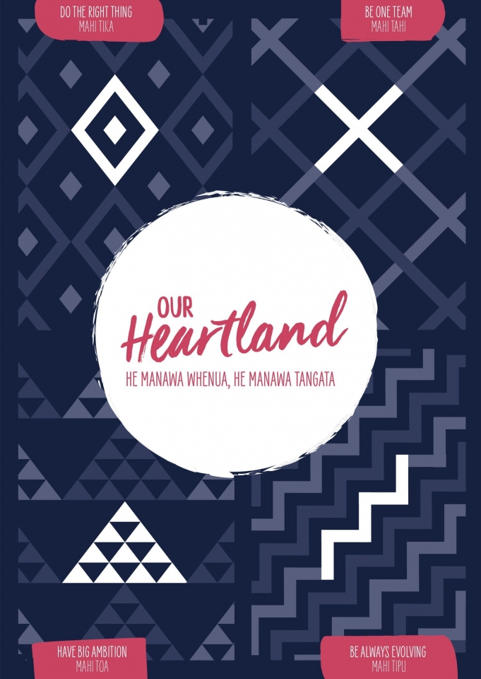
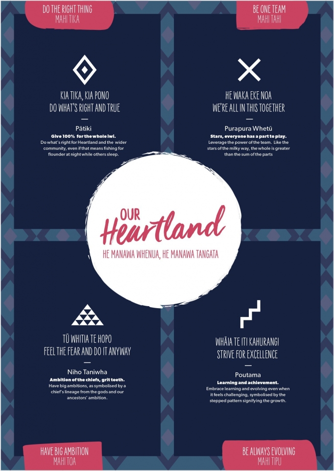
Heartland Bank Symbols - Internal brand
Detailed graphic elements are taken from whare tukutuku panels to represent Heartland's values in a very intimate and engaging way. Using these graphic components to support other text and imagery they drive home Heartland's positive brand messaging to strong effect.
— Alice McKeown
![]()
NZ Post icon suite
We’ve been developing an icon library for New Zealand Post over the last few months (just a snapshot seen here) to support the e-commerce report. A visual tool to communicate some of the more technical areas of their business. Exercising an exacting eye to ensure consistency across hundreds of line weights and adding unique details to make them ‘ownable’ and recognisable for the business.
— Jo Ross