Design is a powerful language with a unique ability to convey feelings and to bring words to life writes Brian Slade
Design is considered a visual discipline. But what excites me most about being a designer is the ability to speak to audiences at both a rational and emotional level, appealing to senses way beyond just sight.
Individuals engage with information in quite different ways, creating a real need for the designer to understand the answer to the question what do we want the audience to feel?
But ask two people how they feel about something and you'll get very different answers. Whatever creative executions we put in front of our intended audiences we will undoubtedly provoke a feeling. The challenge is conjure up the intended feeling. Align this feeling with a desired action and you have a potent formula for successful design.
A combination of colour, graphics, imagery and messaging are the main ingredients we have at our disposal to paint the right picture and evoke the desired feeling.
At the heart of many design communications is colour. The thing I love about colour is the way it sets a mood. Dark colours generally express a more sombre, serious tone; here in New Zealand black is obviously a symbol of national pride, mana and quality; bright colours evoke fun and optimism. But I particularly enjoy the transitions: the ways that movement of colours, say from dark to light, can be used to symbolise transformation, direction or the emergence of hope.
A distinctive visual language should render a complete impression. Choice of fonts makes a message feel architectural or expressive. Photography and other visual graphics can be used to depict literal messages, display concepts or to capture a tone or mood. The growing popularity of infographics helps communicate numbers, proportions and relativity in a highly accessible way. Page layout too can be used to change the pace of a communication, further informing a reader’s experience.
Add this visual language to powerful words and the right tone of voice and you’ll have a very effective communication.
Over the years some of the most enjoyable design projects I've been involved with have looked to express the messages and feelings evoked by music, art or writing. The Tamaki project began for us with a poem – and it’s a great example of how design and words complement each other to appeal to audience’s heads and hearts.
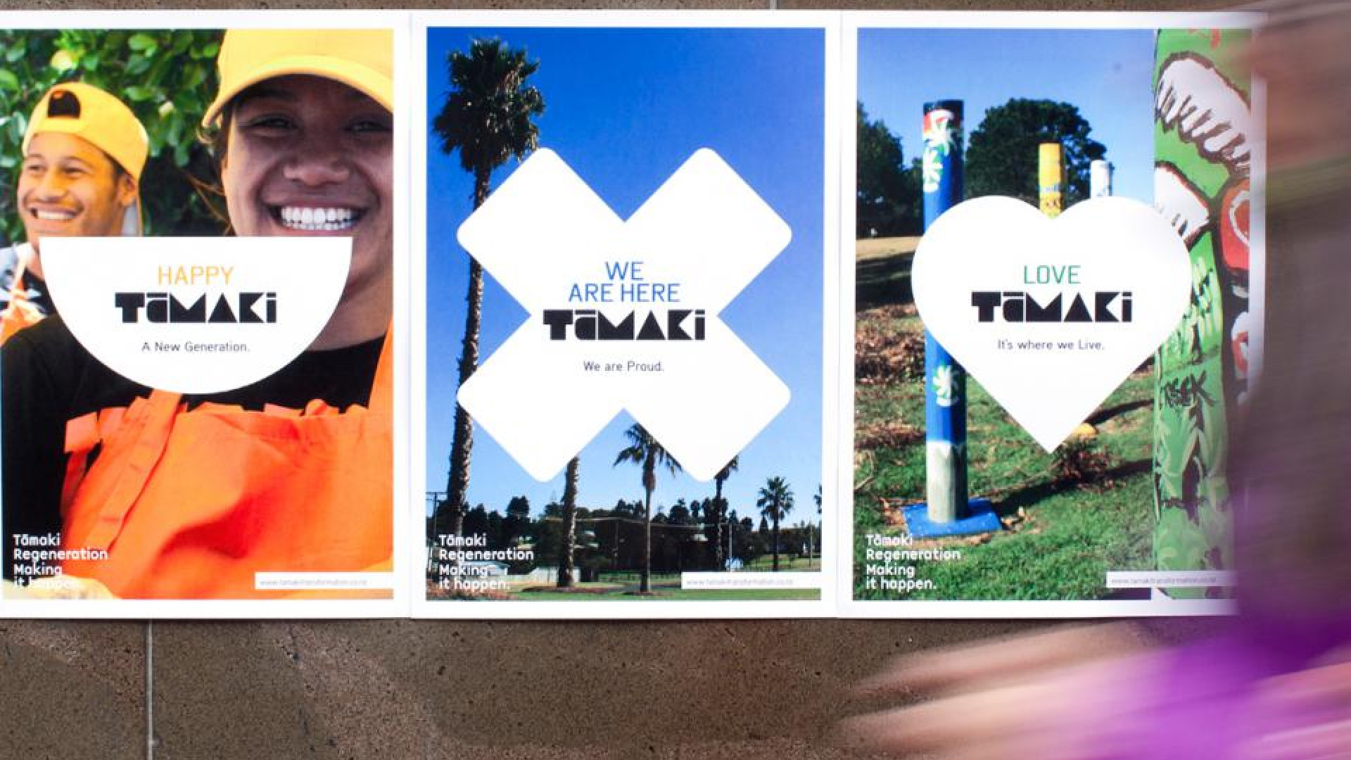
Tāmaki Transformation is the first urban regeneration programme of its kind in New Zealand. It aims to transform Auckland’s Tamaki region by working with the community to improve lives through housing, education, employment, transport and social infrastructure initiatives. Imperative to the programme’s success is ensuring a connection by key audiences with the vision for the area.
The poem, “We are Tamaki” was created by leading PR firm SenateSHJ to express Tamaki’s history, culture and pride in the place and its people. On first hearing it, I immediately felt the power of the words and was able to create a picture in my mind of what the area stood for. Our visit to Tamaki soon confirmed that image - a community that is strong, vibrant, diverse and proud.
The first step was to develop an overarching visual language that would bring the vision for Tamaki to life. The real challenge however was to use this language to speak to a very broad audience set - ranging from the youthful community itself right through to outside partners and politicians. The other challenge was to ensure the vision for Tamaki wasn’t lost, buried amongst the high volume of detailed information that needed to be communicated.
Our design language says We are Tamaki in a similar way to that expressed in the poem. The visual identity focuses heavily on the people of Tamaki and the pride they carry. It reflects the colour and energy that cultural diversity brings to the area and is supported by imagery of the area’s natural, historic and cultural assets. A lively colour palette with specific emphasis on yellow seeks to engage with Maori and Pacific island communities. Photography is deliberately eclectic – focused on people and the community. Typography is solid and bold, almost icon like, and icons themselves are also used as a positive visual shorthand.
Combining the language of words and design has allowed a strong Tamaki regeneration story to be communicated to all audiences. Did the feeling we created resonate with audiences? The community feedback is clear, with many using the word proud to describe how they felt. I guess the answer is a resounding yes.
This article appeared in Marketing magazine, November/December 2013