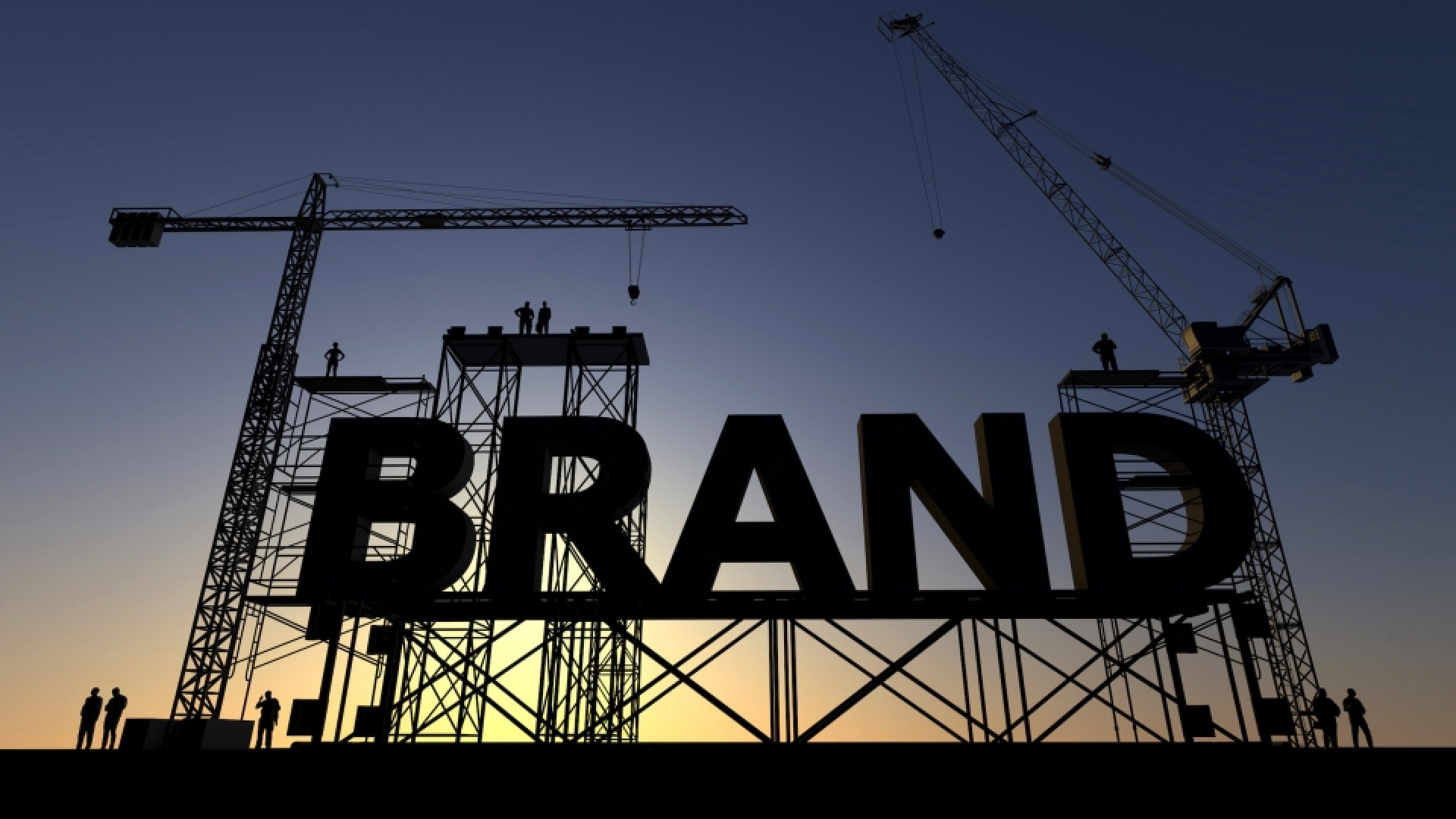
Your brand needs an evolution or a revolution.
But how the heck do you choose the right people to work with to develop, evolve and roll out you brand identity? There’s a fine balance to be struck between ‘contemporary’, ‘trendy’ and something that’s going to 'last the test of time’.
With regards to trends, by nature they come and go, right? Some stick around and morph from one thing to next.
The contemporary ‘now’ creative air is filled with minimalist logos, geometric shapes, bold and playful typography, a touch of whimsical illustration and digital movement. Not too much but just enough: to catch the eye, keep the file size down and not distract you from the content. The 'test of time’ approach though, may take a little more time, funnily enough, but will be worth it.
"Your creative partner will need to start each project like they’re fresh out of art school… but with at least 10 years solid experience."
Each creative brand project should be approached as a unique challenge, so your creative partner will need to have the dexterity to constantly evolve and start each project like they’re fresh out of art school… with at least 10 years solid experience. Otherwise you run the risk of buying a ‘style’ without substance and working with a bunch of ‘cool’ people just going through the motions but not quite 'getting' business and strategy.
So what do you need to be looking for when you go ’surfing’ for a branding consultancy?
The first and most obvious thing to ask before you start, is what kind of partner are you looking for? Strategic creative, visual guide or somewhere in between? Get this right and your path will be a lot easier. Then stay alert, watch, listen and be an active partner in the process.
"What kind of partner are you looking for? Strategic creative, visual guide or somewhere in between?"
Online, what does their website tell you about their view of user experience or customer journey? Did they think about you or themselves when designing their site? Are you being forced to read 9pt text? A trend where designers tried to force readers to squint through the pain barrier has surely been and gone. What about navigating from project to project. Clear and seamless?
What’s their site's work section telling you about their design approach? Can you see a strong 'house' style repeating through their work? Or are you seeing unique solutions in their identity work that closely reflects the characteristics of their client rather than themselves? Is there a focus on the executions with lots of energy put into the business cards they’ve created or is it clear what the client challenge was and how they solved the communications challenge?
Have you spotted an overuse of drop shadows or gradient effects, typography that’s gratuitously stretched or squeezed or work that is simply unclear? Any swoosh in their identities? … great in the late 1990s and keeps on giving for Nike.
Designers solve problems and very few problems are exactly the same, so it follows the solutions you should expect to see would be different. There’s nothing at all wrong with developing stylistic elements to our work, but if it doesn’t distinguish the client from its peers and represent them individually, then 'bad move'.
"Designers solve problems and very few problems are exactly the same, so it follows the solutions should be different."
To sum up… as communicators our job is to walk a fine line in brand communications that create individual, strong, distinct voices for our clients that allow them to evolve over time.