I was recently asked to be part of a discussion on the Kiwi design aesthetic which got me thinking about the topic. So here are my views on what defines the Kiwi style. Given I’m not a trained designer or artist, there is a good chance my views are well wide of the mark. I can only tell you what I see and feel.
Like many, I’m of the view that a country’s approach to the creative arts is a strong reflection of its culture. Australian and American creativity is broadly bright, loud and confident, very much like the cultures of those nations. Scandinavian design is minimalist, considered and efficient. French design is sensual, with flair and individualism.
It follows then that Kiwi design is like us: understated, individual, complex and extremely grounded in nature and reality. We seek to tell stories by creating moods and feelings, crediting our audiences with a level of intellect, rather than always stating the obvious. It doesn’t mean that it’s all dark, brooding and intellectual, in fact, it is often the complete opposite, as we rarely take ourselves too seriously. The Hunt for the Wilderpeople may be one of the best expressions of the kiwi creative mindset with its complex relationships showcased through off-beat humour.
Much of our graphic design style comes from our colonial heritage but, whether we like to admit it or not, our graphic palette also has a strong Pacific flavor to it. We see this often in simple two-dimensional shapes made to stand out against flat colours. Similar to the Japanese aesthetic, we prefer design to not be overly perfect and crafted but to feel natural. We favour flowing forms over straight lines, again a reflection of our surroundings.
The tone of our work is often muted and dark with a heavy dose of realism. We use a lot of natural and rustic colours such as greys, greens and browns to express the world around us. We prefer real life over presenting places and scenarios in idealistic ways. And reality is also the driver for depicting people, staying away from over emphasising an individual’s positive assets, preferring to highlight their imperfections.
What I love most about the Kiwi aesthetic is our use of language. There’s always that cheeky, sarcasm-loaded, sense of irreverence that reflects Kiwi humour and our ‘she’ll be right’ approach to life. I think it’s what makes our work, particularly in advertising, stand out from work from around the world.
The NZ design aesthetic will continue to evolve as the diverse tapestry that makes up our nation broadens and as we become more regional and global. To some degree I welcome this, but I do worry that our style will become less our own. I’d like to see us embrace more of the Maori and Pacific flavours that make our design voice unique, while also working hard to ensure our Kiwi tone of voice never loses its cutting edge.
What do you think defines the Kiwi Design Aesthetic?
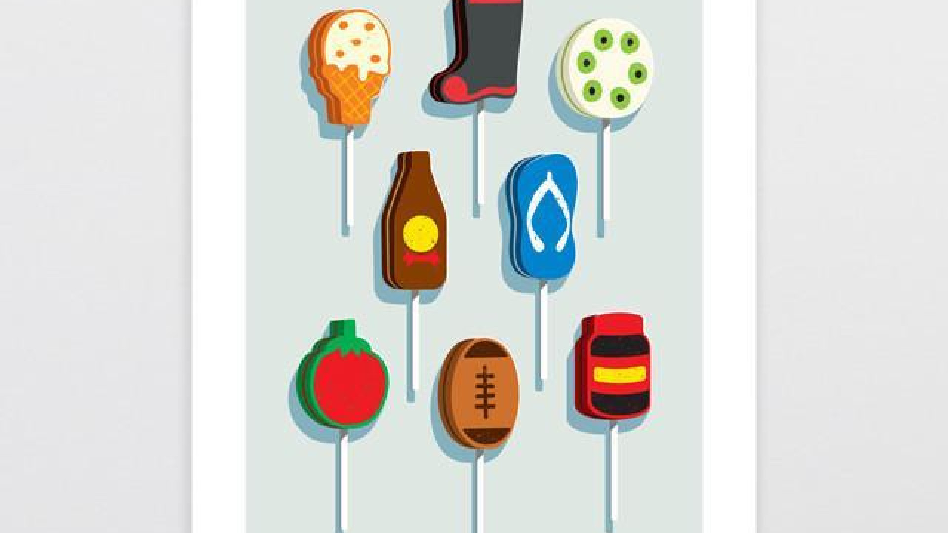
Image from https://www.glennjonesart.com/products/kiwiana-flavour

