How do you create strategically creative ideas that capture the imagination? This week we asked the team to choose examples of our work that demonstrated this successfully.
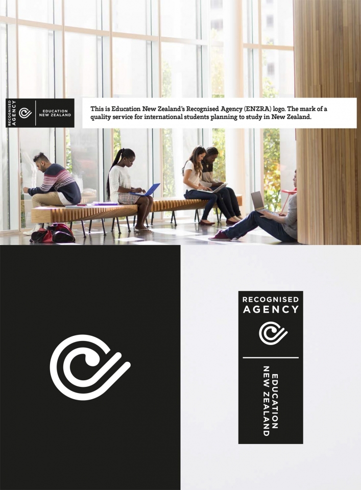
Education New Zealand
An identity for Education New Zealand and their International Recognised Agent. Requiring distinct New Zealand attributes and qualities. We’ve utilised a strong proprietary ‘label’ shape for visual cut-through in a busy and competitive international environment that also controls the hierarchy of elements. The graphic koru has strong New Zealand associations, this as an unfurling fern frond. Made up of two elements moving in the same direction, it emphasises the ‘e’ for education and a subtle tick.
— Brian Slade
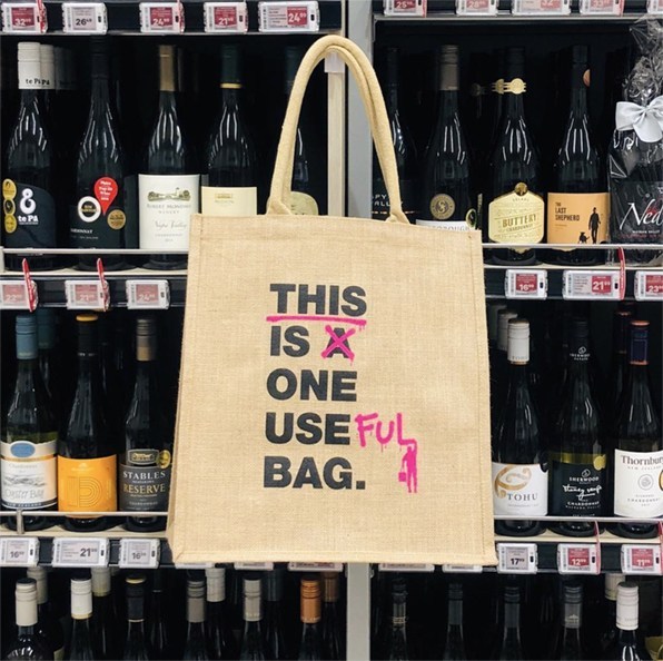
Insight Creative Tote Bag
Strategic creative idea: Taking action
The creative idea for our promotional tote bag is as engaging as it is simple. It plays on the larger idea of taking action against climate change, to the more basic action of defacing a bag. It shows that even small steps can make a change. The punk styling of the bag reinforces this somewhat irreverent style of activism and also brings a smile to your face as you read it. Job well done!
— Sarah Turner

MyHNZ
A more agile use of our strategic creative process. I quickly developed the idea of ‘yours’, Steven added his strategic view to expand and make this more fully realised.
Showing the HNZ tenant portal as an easy, faster way to manage your home. In your time, at yours, your choice etc…. Approachable, lively typography with considered supportive imagery. A quick, campaign style approach informed by strategic thinking.
— Edwin Hooper
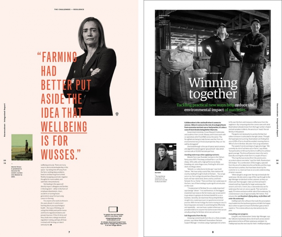
Ravensdown
Ravensdown Integrated Report was a strategic idea that captured my attention because of its distinct and unique approach to an annual report. This was designed in a newspaper format which cleverly displays content in a down to earth, everyday, no fuss way. The design presents key arguments upfront in a bold typographic approach which speaks to their transparency as a business.
— Jo Ross
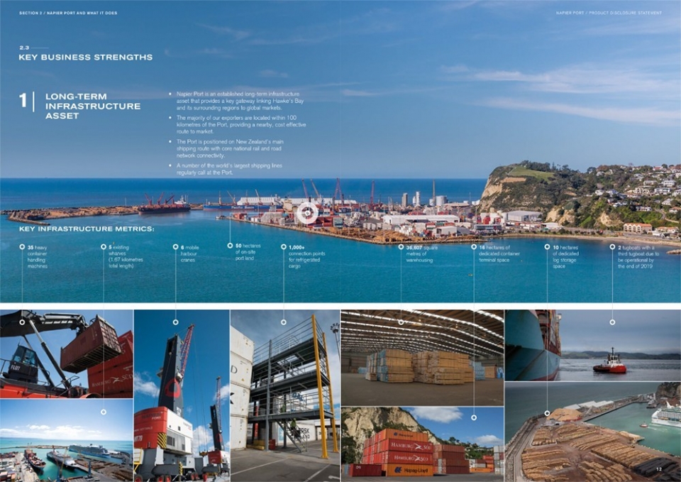
Napier Port
The degree symbol (taken from the logo) is used as a graphic device throughout the document at varying scales. It is used in an abstract form to communicate a range of key brand values including growth from a central point. This symbol is used well to highlight key information and links it clearly back to the brand, as well as adding really nice detail to the document.
— Alice McKeown