This week our team focused on examples of Illustration, and its effective use to communicate a creative idea. Helping the viewer navigate content with often abstract themes, challenging content or sensitive topics. Here’s what the team had to say…


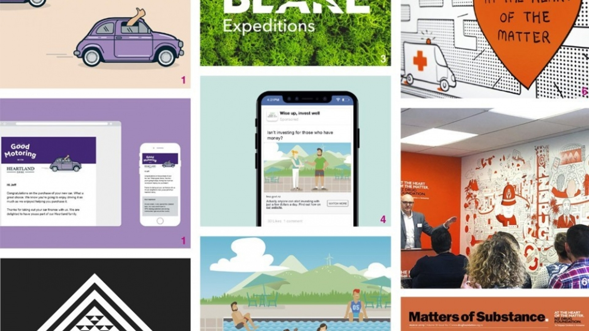
Heartland Good Motoring programme
As part of the visual identity for the Good Motoring loyalty programme, Insight created a simple and friendly illustration that speaks of a positive driving experience. It successfully communicates the idea that driving is a feel-good experience, that gets even better with driving tips, motoring discounts, and rewards offered to Heartland customers as part of the loyalty program. Simple, fresh and energetic illustration of a happy driver zooming in their new car is a successfully executed single minded idea – thumbs up from me!
— Anna Charlett


Te Ture, The Law
This beautiful pattern was created for Meredith Connell offices. Insight worked with the artist Arekatera Maihi to create this taniko design. The forms have a strong reference to protection, connectivity, genealogy, strength, structure and foundations. The artist described the meaning behind the work as follows: “The black outer diagonal bar forms the roof a whare or house – the sheltered safe zone to work in, as well as the law which employees work with and strive to uphold. The internal black bar looks at the connections, the foundations and core of the business. This all sits safely under the roof of the whare. Inside of those areas is the most sacred part of the whare – that is the people, the communities, the families and the workers. This talks about the responsibilities of the company for its clients' whanau and staff. The black niho all face up so as not to be seen to be biting down on the people.”
— Jo Ross

Blake Identity
Intelligent and considered use of an illustrative element for our rebrand of the Sir Peter Blake Trust. A distinctive and unique marque.
— Brian Slade


Financial Markets Authority
This social media campaign worked so well because most content we see about boring things like investments can be a bit dry. Cue the cute illustrated animation about learning to swim! The style is contemporary and clean, with a distinct kiwi feel – no wonder it was a big hit!
— Sarah Turner

Auckland council – Parks, Sport and Recreation
I like that the illustration and illustrated-style text helps to make the information easily digestible and unites three diverse departments together with ease. The illustration style successfully allows the information to be split into three, or broken down further to be used across a range of platforms at a variety of scales.
— Alice McKeown


NZ Drug Foundation
An exciting illustration for a space which is aptly named the Catalyst Room. Here the illustration is a hardworking communication tool – delivering a wide scope of thoughts, initiatives, events and stories for the NZ Drug Foundation. This is all achieved in a friendly and open style, creating sparks of interest through use of brand colour and additional ‘added-value’ quirk that only experienced illustrators can offer to an already content rich brand communication piece such as this.
— Chris Gough Palmer

Matters of Substance – cover
We’ve used a number of illustrative elements across work for the NZ Drug Foundation. One primary reason is its flexibility to use a metaphoric or symbolic approach to develop imagery that communicates the story, or some context to the story – without showing drug use directly. We’ve developed a series of illustrations showing the history of drugs in NZ, and typographic-led illustrations with information about individual drugs. This recent cover uses a stock image base, supported by typographic elements to create a generic ‘protest’ movement of people campaigning against the ‘war on drugs’. The ‘war on us’ term refers to the failings of the war on drugs and treating drug use as a criminal issue over a health one.
— Edwin Hooper