As the media we work with become more sophisticated and diverse, the need to design clearly and deliberately is subject to multiple distractions, writes Brian Slade.
Few issues are as simple as they first appear, and the temptation is always to layer message upon message, visually or verbally, in a bid to provide greater and greater explanation. Growing up with dyslexia has given me ultimate respect for the power and the pitfalls of working with the written word, and for what can be accomplished through well-managed design. It continues to drive my passion for clarity in what is said, to whom, how and, most of all, why.
The discipline of effective design lies in being able to sift everything that’s provided down to communications that are clear and compelling to the reader. Work we’ve completed for the Christchurch Central Development Unit exemplifies this challenge well.
To help attract young people back into the city, we were briefed to develop a competition that asked younger children to develop their vision for the world’s best inner city playground and involved older children working in groups to develop key recovery projects such as the stadium, the convention centre, the Avon River precinct and the library.
Building clarity into the design process starts with a dissection of the brief. I’ve learnt over the years to take very little at face value – indeed a key contribution that a design agency should make to any project is the ability to objectively and systematically filter fact from opinion, research from impression, realistic goal from unrealistic desire.
At first glance, this particular task seemed straightforward enough. However, on closer examination, there were challenging aspects around pride, ownership and connection. How do you make a competition that is fun for three year olds and hip for teenagers up to 18? How do you ask children to reimagine a place to grow up in that wasn't accessible to them?
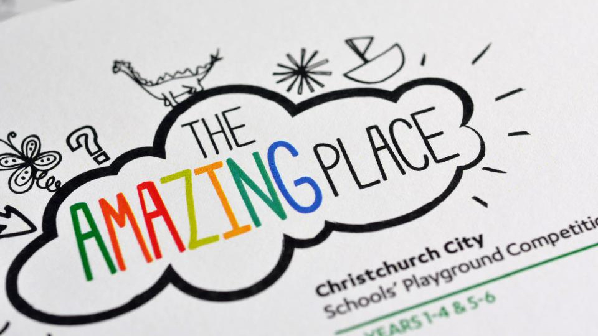
We started by determining the name. “The Amazing Place” captures the aspirations for Christchurch and invokes the competitive element through its subtle reference to a well-known reality show. The visual identity was correspondingly flexible: designed to speak to students of all ages and to teachers and school principals whose engagement was critical for incorporating the competition into the school curriculum.
Next challenge: does everyone understand exactly what’s required and will they feel excited to be involved? We kept distilling the delivery mechanism … until it was a simple yellow brick. This brick symbolised the building blocks for the city’s recovery while evoking the fun and adventure associated with the ‘yellow brick road’. Within the brick were brochures, banners, posters, ‘thinking caps’ and giveaways that schools could use to understand and promote the competition to students.
The website provided further interest and excitement in the competition and the future vision for the city. It also served a practical function, delivering detailed information for teachers, students and their parents and acting as a cost-effective portal for schools to register and order further materials. Facebook and Twitter helped generate discussion, encourage collaboration and build ‘buzz’.
The competition has now been running since late January and continues over the first two terms of the school year. CCDU has been delighted with the feedback and support from the local community and the take up from schools and students. My hope is that An Amazing Place has inspired the children of Christchurch to articulate a clear vision for the city they hope to grow up in. Through this competition, and all the work going on around Christchurch right now, perhaps it will indeed be everything they imagined.
This article appeared in Marketing magazine, July/August 2013

