What might at first seem a familiar creative challenge often requires a different solution from the one used before, writes Brian Slade. And that is certainly the case for city identities.
You can easily make the mistake of assuming that once you have solved a particular problem, you have the answer to how to solve it again and again. Sure it gives you an insight into potentially how you might tackle it again but be careful of the cookie cutter solution. It can lead you up the expensive, unrewarding or ineffective garden path.
One of the great aspects of being a designer is the insight you get into organisations - quickly needing to assess the problems they face and understanding how you can apply your knowledge. Past experience is a great framework for assessing a problem or opportunity but, as our experience with city identities has taught us, it doesn’t instantly provide us with the right solution.
Over recent years we’ve worked with a number of local councils and government agencies to create city visual identities, brand tool boxes and communications platforms that fundamentally serve to engage in dialogue with local residents, inbound tourism or investment audiences.
The first question to ask is ‘where is the organisation in its visual identity evolution?’ Tararua District Council was new, created through boundary changes. I worked with them to develop two identites that were visually linked but quite independent. The first, a council one that residents payed rates to and identified services. The second, a tourism/investment identity that leveraged off the first but was much more expressive. This clear line allowed the two to talk to distinctly different audiences and worked really well. This second identity was later evolved further to include a more regional focus. Tamaki, Auckland, although very early on in their visual identity development, has a long proud history. This was captured in a poem ‘We are Tamaki’ which we used to form a unified voice aimed at getting both local community and government to support the vision for Tamaki Transformation. This objective meant the approach was quite different from Tararua although both had been in a similar stage in the life cycle.
The next question is ‘what equity has the organisation already built?’ Albury City in NSW, Australia was much more evolved as an identity. They had established their logo some time ago, representing the council but also the city. What they lacked were the tools to communicate, under one identity, to multiple audiences. We achieved this by developing a core brand story and visual idea for the city that was then able to be expressed into a flexible tool kit that could be dialled up or down depending on the audience they were speaking to. This gave them complete flexibility. Quite different from Tararua or Tamaki because of the much earlier strategic decision to represent the city and council under one identity.
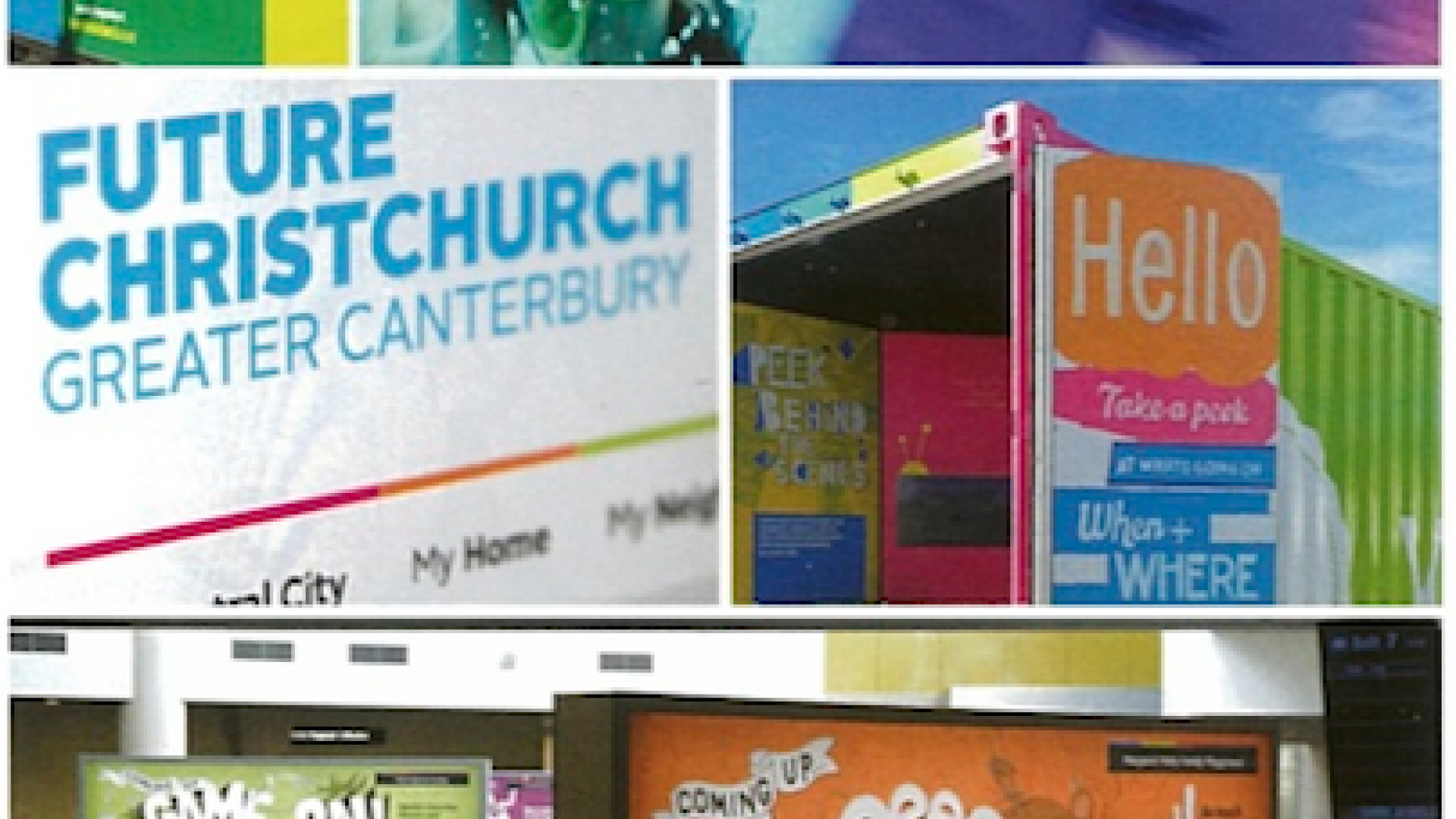
After the 2011 earthquake in Christchurch the answer to the question of visual identity life cycle was obviously quite different. The ‘Garden City identity’ was in quite a different place. With so much equity lost and subsequent identity ‘noise’, the question was ‘what do local residents need?’ Part of the solution was the development of a vibrant, optimistic and very much independent vehicle to engage locals about what was happening in their city, quite different from Tararua, Tamaki or Albury City.
We inherited a fledgling Future Christchurch website and identity. The first thing we did was to develop a strategic framework unique for its purpose, giving the work that followed the foundation it needed. We took the bare essentials of the existing creative and stripped these back to a point where all that was left was the core existing name and the idea of using a broad colour palette - the key attributes that spoke to the strategic intent.
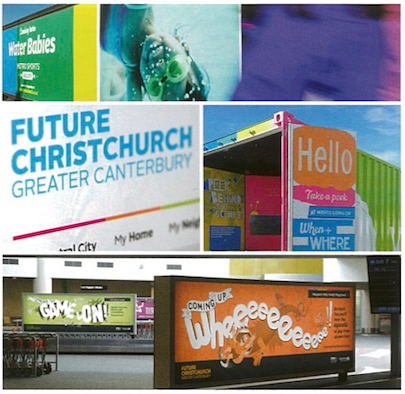
Working closely with a very positive client we were able to evolve the name to be more regionally inclusive, and give the identity generous stretch. We consolidated this into a practical design system, adding a typographic set, an independent logotype, new visual language and distinctive tone of voice messaging. The new identity sytem allowed for broader communication and stretch across multiple channels. Packaging it up into a set of guidelines, with examples of how it worked, we then shared it with the various internal and external design teams to implement.
We’ve managed this collaborative brand rollout process with a few clients, finding the best way is open honest dialogue, working out strengths and weaknesses early on and being honest about them.
It’s one of the most positive experiences contributing to a city that is grappling with how to visually represent and express itself to its audiences. It’s very tangible and ‘real’. You get to walk around and see your work in action. A uniquely special city required a unique solution that was right for them. Obviously having that background knowledge to city identities really helped us offer up, not a cookie cutter solution, but an approach right for Christchurch at their stage of the identity life cycle.
- Published in NZ Marketing Magazine, July/August 2015