Creative Director, Brian Slade, reviews aspects of Insight's body of work over the 2015 annual reporting season.
A highly emotive aspect to all graphic communications and subject to trends and association, colour throws up challenges that can scare even the most battle-hardened of designers and be an ‘Aladdin’s cave’ for others.
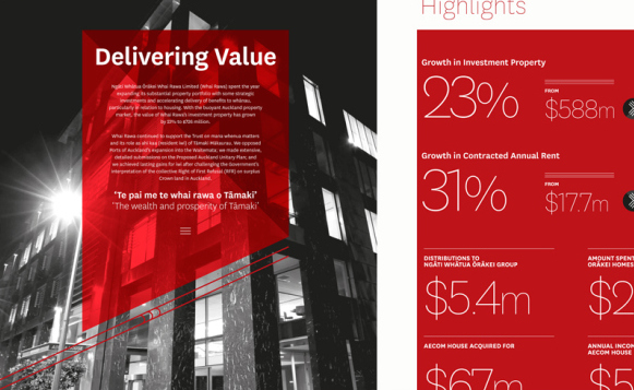
Ngati Whatua’s three reports rely on strong colours to distinguish between them, ochre, blood red and green with a healthy dollop of black. This primary colour palette supported by desaturated and well graded full colour imagery has developed over the past three years, creating a very solid and consistent look and feel.
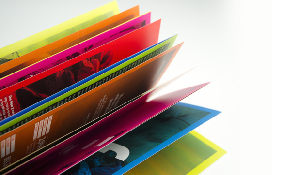
If you're after a colour fest, Stand Children’s Services' report takes it to the next level. The first 27 pages are uncompromisingly full-on colour, multiplied over full colour images that were delicately image-worked to create subtle depth. A brand full of colour, this document is colour central.
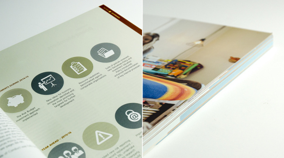
Soft and muted tones support NZ Super Fund's visual identity. Excellently executed, this year's report creates a sense of calm, organisation and thoughtfulness. Colour tabbing is cleverly used on the leading edges of the pages to aid navigation between the multitude of financials.
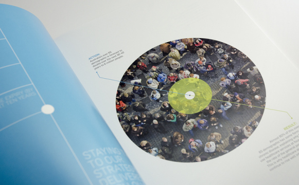
Vital’s two primary support colours are used really well in this report to focus the viewer on the graphic message. Strong use of ‘controlled’ white space guides you and helps focus the eye on the target. This report feels clean, fresh and clinical.
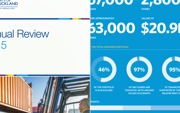
There are generally two ways to ‘own’ colour in a visual identity. Either minimise its use within a communication, using supportive neutral colours for it to be projected off, or minimise the use of other colours in the palette and use it boldly. This year for Ports of Auckland, we pulled back on the colour usage with a few notable exceptions on the infographics pages, restraining the report to only a couple of colours.
If you’ve read this far, congratulations… let us know what you think of these creative projects and keep an eye out for Powerful Annual Reporting Results 04. Graphics, coming soon.