The workplace is the physical manifestation of the brand
Client: Meredith Connell
Expressing a new brand that has a marked attitudinal and industry difference is aided significantly by being consistent in the work environment.
Meredith Connell’s bold new brand position was brought to life in their transformed reception and meeting spaces. Visitors instantly know that this is a law firm with a big attitude and confidence to stand apart from their peers.
The Brief
To create an engaging environmental design for Meredith Connell’s newly transformed reception/meeting room areas by utilising the visual identity assets to communicates the core - ‘bringing the right attitude’ – brand idea.
The Solution
Working with the architects, we created a suite of graphics that not only expressed the confidence and attitude of the brand, they also offered an element of surprise for visitors who entered reception and its adjoining meeting rooms. Avoiding clichéd shiny finishes and expensive contemporary art-pieces, we wanted visitors to instantly know that this was a firm with a difference. This is also the main thoroughfare for staff, to and from their own office, becoming a great place to reinforce brand behaviours and messages.
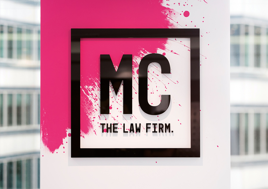
The ‘blood-splatter’ logo (which is now its affectionate name) greets visitors in reception, making for a lasting impression and sending a clear message that this is a firm who doesn’t take themselves too seriously.
Individual furniture pieces, reflecting the core brand colours, were arranged to encourage interaction and engagement – attributes core to the brand. Strong typography is central to the identity so bold statements dominate meeting room walls, clearly showing this is a law firm who knows who they are and what they stand for.
We also created a series of prints, to be regularly updated, for meeting room walls, playing on the notion of bringing the right attitude into the workplace. Privacy decals, inspired by chesterfield sofas, sit proudly on meeting room windows expressing a sense of quality and heritage.
Colour was a big factor in bringing all this together, make it more inviting, and going against the grain of what is expected of a law firm.
The Results
The feedback we’ve received has been extremely positive. Visitors are engaging with the graphics, which have become a conversation starter for the brand. Reception has become a focal point for staff to meet, further adding to the sense of energy and dynamism of the brand. The number of client meetings in the office has also increased, which suggests staff feel confident that the environment tells a brand story they are proud of.


