Client: Eastern & Central Community Trust
The Eastern & Central Community Trust has been making a transformational impact on their community for over 30 years. A new story and identity has re-energised their passion and helped them relate more effectively.
The Brief
ECCT have been supporting communities achieve their aspirations for over three decades. Their work drives participation, building stronger and more resilient communities. Since inception, they have distributed over $135million in community grants. With a new purpose and strategy, ECCT asked us to help them express a strong and engaging story that captures who they are, what they do and the transformational impact they have on the communities they work with.
The Solution
As always, the process started by listening. First, through discussions with ECCT’s senior leaders to understand what they do, how they do it and the impact it has on the community. Followed by exploring the various community group stories and how ECCT funding had allowed them to deliver community outcomes.
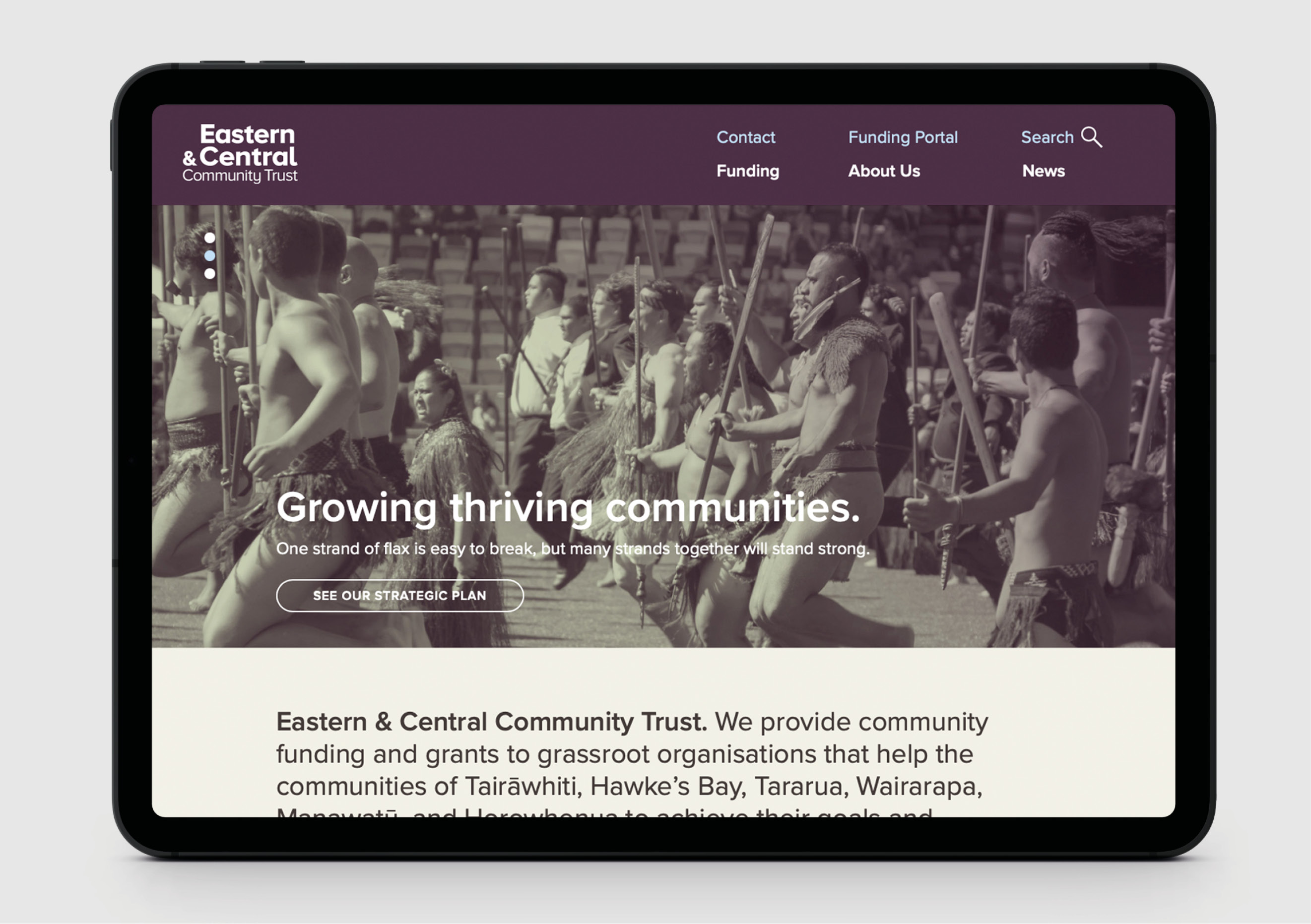
Growing Thriving Communities quickly became our brand proposition and single-minded idea. The idea was built on the whakataukī about unity, working together and the strength of community:
Kotahi te aho ka whati;
ki te kāpuia e kore e whati
One strand of flax is easy to break,
but many strands together will stand strong.
The new logo represents ECCT’s six regions advancing as one towards greater prosperity. The traditional Taki Toru arrangement reflects the community need, matched equally by ECCT’s response. The logo’s upward trajectory speaks to the regions thriving while the solid triangle base speaks to growing stronger and more sustainable communities.
The new colour palette is inspired by the Harakeke flax which can be found from the coast to the mountains throughout ECCT’s region. The harakeke flax plant represents the people who are at the core of ECCT’s communities. The rito (shoot) is the child. It is protectively surrounded by the awhi rito (parents). The outside leaves represent the tūpuna (grandparents and ancestors). The use of a colour gradient – that goes from dark to light - showcases the transformational change that ECCT makes to the communities they serve.
Real photography captures both the community need and the positive outcomes that funding enables. To illustrate big impact stories, the colour gradients are applied over them. To create texture, visibility and unity to all designed applications, the logo’s Taki Toru pattern is used over images and blocks of colour.
This rich new identity toolbox was applied to deliver rollout material ranging from documents, email signatures, business cards, signage, merchandising and vehicle livery. The most notable development was a new website bringing both the brand story and new identity to life (www.ecct.org.nz). The site heroes the community stories, while making it as easy as possible for local groups to apply for funding.
The Result
The client tells us that the story and identity have energised them, firing up their passion for making a difference for their communities. It’s become a catalyst for community groups to engage with them and a vehicle for consistently engaging communications with all their stakeholders. All the things a good brand should do to enable business purpose and strategy to deliver.


