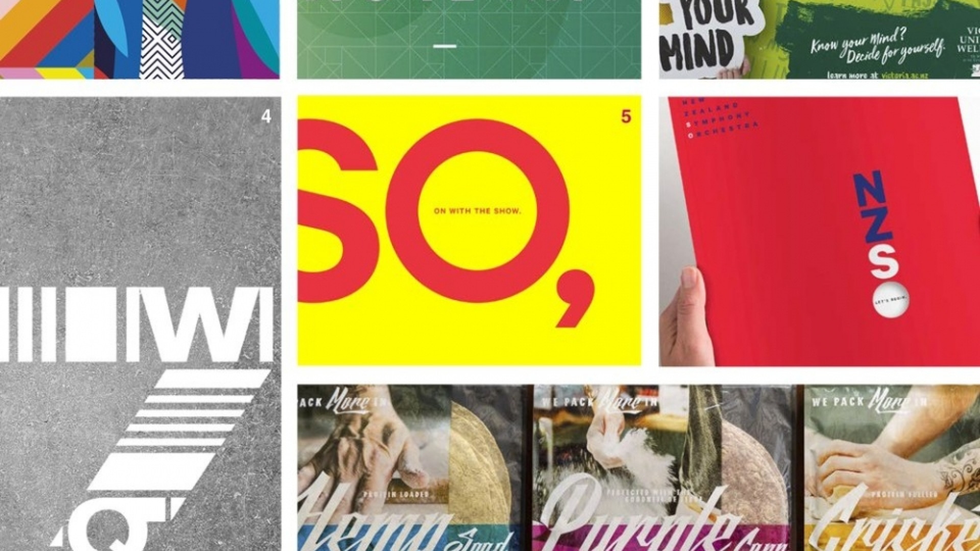
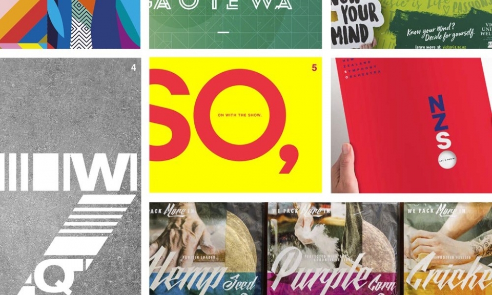
Since I started at Insight Creative, there has been much talk about how we need to stop occasionally and take the time to celebrate our creative achievements. So with that in mind, let me introduce examples of great typography created within the walls of Insight within the last 12 months, as seen through the eyes of our design team:
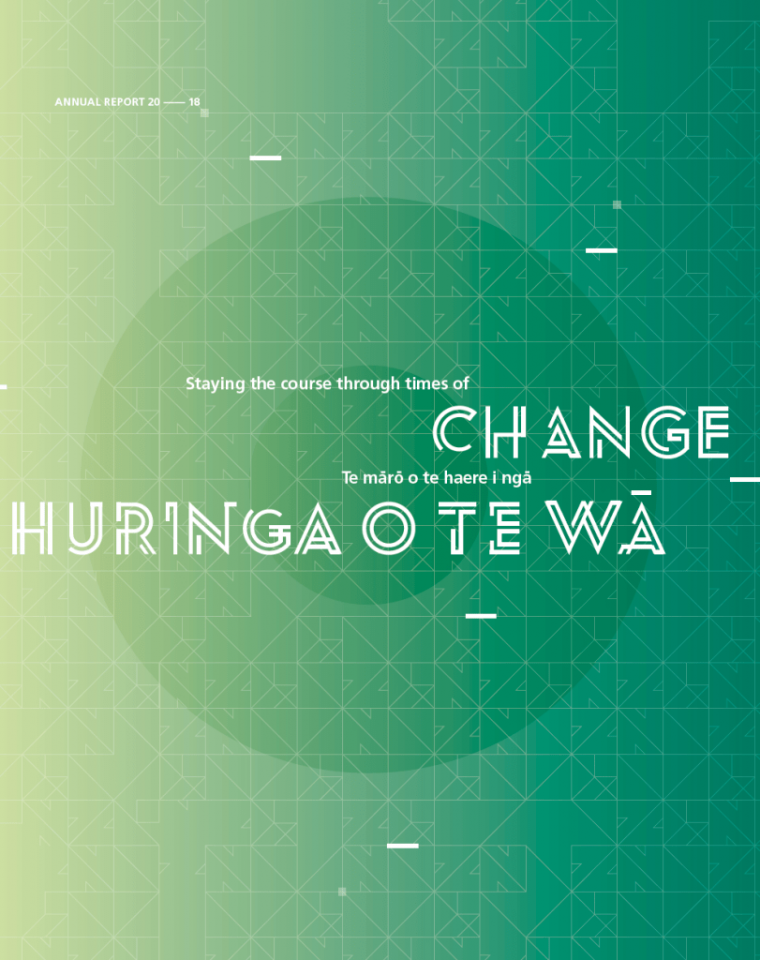
Custom Typography / NZ Super
I just think it’s great that we took the time to create something bespoke for a client that many people might consider ‘a bit dry’. It’s going the extra mile for them, but also gives us something to feel chuffed about. The theme of the report was constant change, so the fact that the typogrpahy character changes and evolves throughout the document is really fascinating.
— Sarah Turner
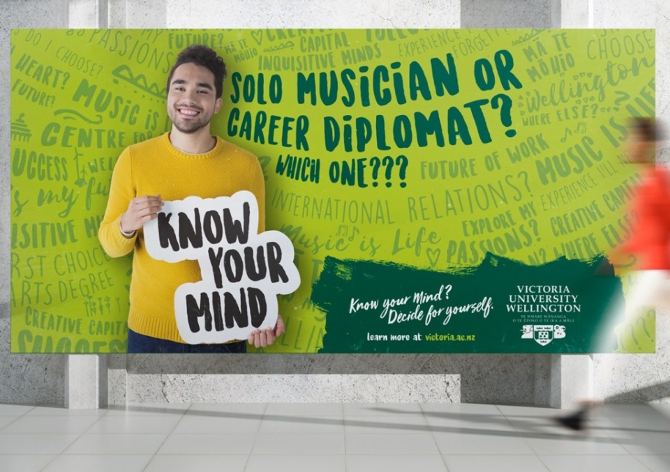
Handwritten type / Victoria University
The typography used for Victoria University's 2019 recruitment campaign successfully delivers the concept of thoughts swirling around a young person’s mind. The hand-written form, using various sizes, cases, and styles, conveys the different options/thoughts when considering their future career, while also subtly promoting Wellington. This all reinforces the strategic idea that you know your mind and that Vic will teach you how to think, not what to think. Composing those different type treatments together, evokes a compelling visual that connects with potential students making those big choices; it cleverly delivers the message that Victoria University is the place where you can decide the route to fulfil your potential.
— Anna Charlett
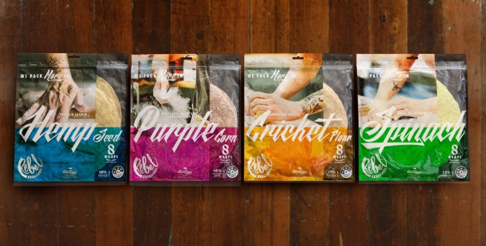
Creating a 'Black' font / Breadcraft
When do you get a chance to use a ‘Black’ font? In my experience not that often. With this new range of wraps, we were aiming to express the ‘Rebel’ at every touchpoint, and so we combined a slightly redrawn version of Black Future, redrawn Copperplate Gothic 33BC, Aardvark and Trade Gothic.
— Brian Slade
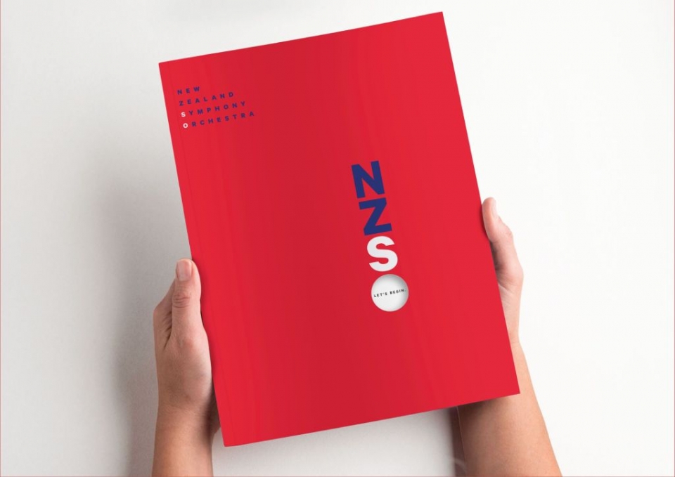
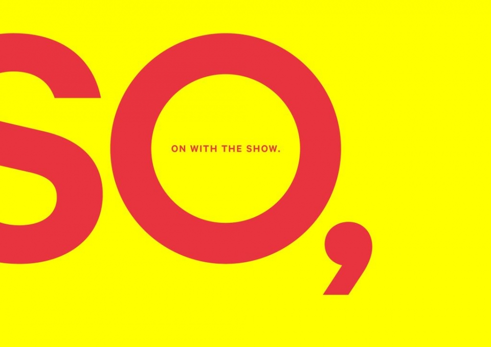
Typography as a graphic device / NZSO
I really like the way the typography is the central graphical device in bringing the idea to life: “SO… let’s begin. SO… on with the show” is a really clever idea. Bold and simple, with good use of colour and scale.
— Jo Ross
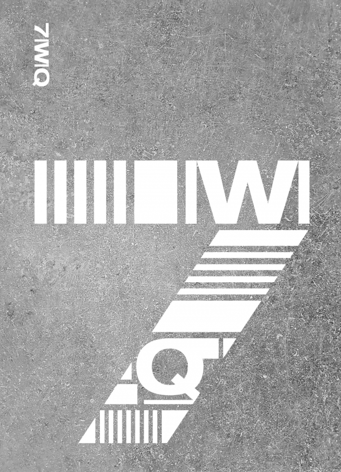
Architecturally inspired typography / 7 Waterloo Quay
We are working with Argosy on some signage elements for 7 Waterloo Quay (formerly known as NZ Post House). We’ve developed a typographic approach informed by the brutalist Architecture of the building. The feature 7 graphic made up of elements echoing ‘7’ and of similar proportion to concrete elements used in the building.
— Edwin Hooper
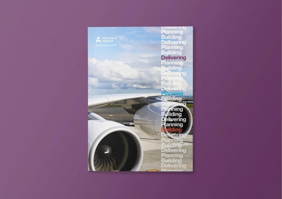
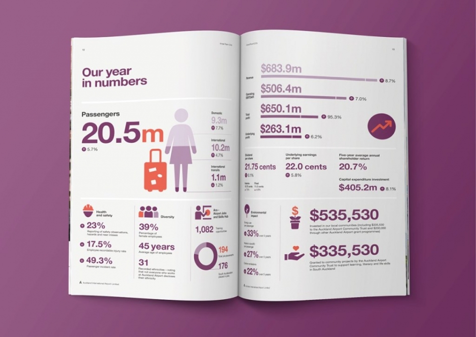
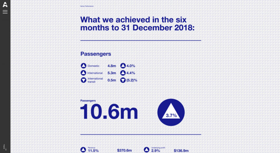
Good ol' Helvetica Neue / Auckland Airport annual report
Here it is presented boldly in the Airport's Report. Amongst the billion dollar busyness and ongoing construction at Auckland Airport, the typography adds a sense of confidence, clarity and calm; expressing the ongoing growth of the Airport’s infrastructure through the repeated titles – underpinning the theme of the report ‘Delivering, Planning, Building’. And of course the way it translates online is also great (as it should).
— Chris Gough Palmer
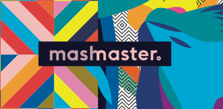
Wordmark / Mashmaster
The typography created/used for Mashmaster word-based card game instantly reinforces the concept or ‘big idea’. By combining the ‘h’ and ‘m’ the concept of two elements combining to create a unique hybrid is visually represented. It shows the amalgamation of two elements becoming a quirky, and creative final product.
— Alice McKeown